Bleed, trim, and safe area: the print file checklist that prevents reprints
Most reprint requests come down to three file-prep mistakes. This is the simple checklist that prevents them — bleed, trim, safe area, color mode, and resolution.
If a print job comes back wrong, it’s almost never the press’s fault. Nine times out of ten, the file was wrong before it ever got there — and the symptoms are predictable: a sliver of white edge around a “full-bleed” design, text shaved off near the corner, a logo that looks soft because it was a 72 DPI screenshot.
This is the short version of the file-prep checklist we wish every customer ran through before clicking Upload. Five things. If you do all five, you almost never see a reprint.
1. Add bleed: one-eighth of an inch on every side
Bleed is the extra art that extends past the trim line of your finished piece. When the press cuts a stack of business cards down to size, the blade can drift by a hairline — and if your background color stops exactly at the edge of the card, that drift shows up as a tiny white sliver. The fix: extend any background color, photo, or design that goes to the edge by 0.125” past the trim line on every side.
For a standard 3.5” × 2” business card, that means your file should be 3.75” × 2.25” total — with the design bleeding all the way to those outer edges, knowing that the press will cut at 3.5” × 2”.
2. Keep important content inside the safe area
The opposite problem: if you put your logo, your phone number, or any text right against the trim line, that same hairline drift can shave off a letter. The safe area is 0.125” inside the trim line — anything important should sit there, not at the edge.
Together: bleed extends 0.125” outside the trim, safe area starts 0.125” inside the trim. The 0.25” total margin is your insurance policy against blade drift.
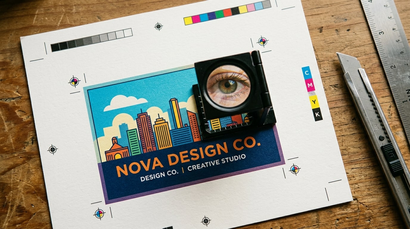
3. Build files in CMYK, not RGB
Your monitor renders in RGB (red, green, blue — additive color, light-based). Print uses CMYK (cyan, magenta, yellow, black — subtractive color, ink-based). They’re different color spaces, and what looks vivid on screen often comes out muddy on paper because RGB has colors CMYK literally can’t reproduce — neon greens, deep electric blues, and phosphorescent oranges in particular.
If you build in CMYK from the start in Illustrator or Photoshop, what you see on screen is closer to what you’ll get on paper. If you build in RGB and convert at the end, expect some color shift.
4. 300 DPI for everything that isn’t outdoor signage
Resolution is independent of file size — it’s about how many ink dots fit per inch when the file is sized for print. The standard for commercial print is 300 DPI at the final printed size. For a 4×6 postcard, that means your image should be 1200×1800 pixels minimum. Anything below 200 DPI starts looking soft; below 150 DPI is unmistakably blurry.
Outdoor signage is the exception — banners and yard signs are viewed from feet or yards away, so 150 DPI at full size is usually plenty. Trying to print at 300 DPI on a 10-foot banner gives you a 36,000-pixel-wide file that crashes design software.
5. Outline your fonts (or embed them)
If you send a press a layered .AI or .PSD file with live text, and the press doesn’t have your exact font installed, the text reflows. Sometimes silently. The result: your beautiful custom-kerned headline now reads in Helvetica because that’s what the press substituted.
Two fixes: in Illustrator, Type → Create Outlines turns every text object into vector shapes (no font dependency). Or, export to PDF/X-1a, which embeds fonts inside the file itself. PDF is the safer default for print delivery — it locks down typography, color management, and image placement in one go.
A 30-second pre-flight sanity check
Before uploading any print file, look at it in your design app and ask yourself:
- Is the document size = trim size + 0.25” total (0.125” bleed each side)?
- Does any background color or full-bleed image actually extend into that bleed area?
- Is all text and any logo inside the safe area (at least 0.125” from the trim line)?
- Color mode = CMYK?
- Photos and logos = at least 300 DPI at the final printed size?
- Fonts outlined or embedded (export as PDF/X-1a if unsure)?
If yes to all six, your file is ready. If no to any, fix it before you upload — once it’s on the press, the reprint is on you.
Most BQP product pages list the exact dieline, bleed, and safe-area dimensions for that specific product right under the Specs tab. When in doubt, look there before exporting your file.