Rack cards: where the tall skinny format actually shines
A working guide to rack cards — the 4x9 format, when the slim shape beats a flyer or postcard, stock and coating choices, and how to design one that earns its slot in the display.

A rack card is a piece of print designed around a piece of furniture. The tall, skinny 4x9 shape exists because brochure racks exist — the wire and acrylic holders on hotel front desks, visitor-center walls, restaurant counters, and the lobby of every business that wants to be picked up on the way out the door. Get the shape right and your card sits at eye level in a slot built for it. Get it wrong and you’ve printed an oversized postcard that flops over in the holder.
So the question isn’t whether rack cards are good. It’s whether your distribution actually involves a rack. Here’s the working frame for when the format earns its keep and how to design one that gets pulled.
The short version
- Rack cards win when there’s a physical display. Hotels, tourism counters, waiting rooms, trade-show literature stands — anywhere a stack of cards sits upright and people self-select. No rack, no reason to use the shape.
- The format is 4x9 (sometimes 3.5x8.5). Tall and narrow so it fits standard brochure-rack slots and shows its top third above the card in front of it.
- Design the top third like a billboard. In a full rack, only the top inch or two of each card is visible. That strip has to sell the pull by itself.
- Match the stock to the life. Cards that live in a public rack for weeks need a coating that survives handling; a card you hand out once can be lighter.
What a rack card is built to do
A rack card’s whole job is to be chosen. Unlike a flyer you hand someone or a postcard that lands in their mailbox, nobody gives a rack card to anyone. It sits in a holder among ten other cards, and a stranger decides — in about a second, scanning a wall of tourist offers — which ones to pull. That self-selection is the format’s strength: the people who take your card are pre-qualified by their own interest. It’s also the constraint that should drive every design decision.
The shape is the format’s first advantage. At 4x9, a rack card is taller than a postcard and narrower than a flyer, which does two useful things:
- It fits the rack. Standard literature racks have slots sized for this format. A folded brochure works too, but a flat rack card is cheaper to print, doesn’t need to be folded, and stands up straighter in a thin slot.
- It shows its face when stacked front-to-back. When a rack is full and cards overlap, only the top portion of each card peeks above the one in front. The 4x9 proportion is designed so that visible strip is tall enough to carry a logo and a headline.
The default format is the standard rack cards product — a clean two-sided 4x9 canvas on coated cardstock that covers the overwhelming majority of rack-card uses at a price that makes filling a dozen displays affordable.
Who gets real value from rack cards
The pattern is consistent: a business whose customers encounter a display before they encounter the business.
- Tourism, hospitality, attractions. This is the home turf. Tours, museums, restaurants, escape rooms, wineries — anyone who lives or dies by the hotel-lobby and visitor-center rack. If your competitors are in those racks and you’re not, you’re invisible at the exact moment a traveler is deciding what to do today.
- Hotels and resorts (in-room and front-desk). Spa menus, dining guides, activity cards, local-partner offers — rack cards organize the “things to do here” pitch without the bulk of a brochure.
- Real estate and open houses. A rack card sized to a single listing, propped on the kitchen counter, carries the specs and a QR code home far better than a loose sheet.
- Medical, dental, and wellness waiting rooms. Service menus, procedure explainers, membership offers — a rack card on the reception counter gets picked up while someone waits.
- Service businesses with a counter or lobby. Gyms, salons, auto shops, banks. Any place a customer stands at a counter with idle attention is a place a rack card works.
If your customers never stand in front of a display rack, the format loses its main advantage — and a postcard or flat flyer will probably do the job for less.
Designing the top third like a billboard
Here’s the single rule that separates rack cards that get pulled from rack cards that get ignored: design the top third first, and design it to work alone.
In a packed rack, the bottom two-thirds of your card is hidden behind the card in front of it. The only thing a passerby sees is that top strip. If your logo, your hook, and a hint of the offer aren’t all living up there, your card competes on a blank header — and loses to the card that put its beach photo and “Sunset Catamaran Tours” right at the top.
Build the front in this order:
- Top third — the grabber. A strong image and a short, benefit-first headline. This is the part that’s always visible. Treat it like outdoor signage: legible at a glance, high contrast, no fine print.
- Middle — the substance. Three or four reasons to care, or a short bulleted list of what you offer. This is what they read once they’ve pulled the card.
- Bottom — the action. Phone, website, QR code, address, hours. One clear primary action. A QR code earns its place on a rack card because the reader has the card in hand and a phone in the other.
Use the back, but don’t overload it. The back is where a map, a coupon, detailed hours, or a longer description live. A common and effective move is a perforated or printed coupon on the back to make the card trackable — the same logic that makes tearoff postcards work for measurable response applies here.
A few production notes that trip people up:
- Respect bleed and safe area on a tall format. The narrow width means margins feel tighter than on a postcard. Keep critical type well inside the safe zone — full details in our print file checklist.
- Mind the visible-strip line. Mark roughly the top 1.5–2 inches in your layout as the “always seen” zone and make sure it stands on its own.
- Double-sided is standard, so use both sides. A blank back is wasted real estate on a piece people physically hold.
Stock and coating: match it to the card’s life
A rack card’s stock should be chosen around how long it sits in public and how much handling it takes.
- Standard displays: A 14pt or 16pt cardstock with a gloss or matte coating is the right default. Gloss makes photography pop, which matters for tourism and hospitality cards selling an experience. The coating also resists the fingerprints and edge wear that come from sitting in a heavily browsed rack.
- Premium feel: For higher-end venues — boutique hotels, upscale dining, luxury services — a heavier stock and a soft-touch or specialty finish signals quality before anyone reads a word. The Akuafoil rack cards option adds a metallic foil effect across the print that genuinely stops a hand mid-scan in a crowded rack; it’s the rack-card equivalent of putting your card in a spotlight. Worth it where standing out against a wall of glossy competitors is the whole game.
- High-turnover or outdoor-adjacent racks: If the cards refill constantly or sit near an entrance exposed to weather, lean toward a thicker, coated stock that won’t curl or scuff. The cheapest stock is a false economy when the labor of stocking racks across town dwarfs the paper cost.
The math favors not cutting corners. You’re paying to design the card, print it, and distribute it to displays; the per-card paper upgrade is the smallest line in that budget and the one most visible to the customer holding it.
When a rack card is the wrong call
For balance, the cases where the format is a mismatch:
- No display, direct handoff only. If you hand cards to people one-on-one, a standard business card or a postcard is more natural. The 4x9 shape only pays off in a rack.
- Mailed campaigns. Rack cards aren’t a mailing format. For direct mail, use a postcard sized and weighted for the mail stream.
- Lots of content to deliver. If you genuinely need to explain a complex offering, a folding tri-fold brochure gives you the panels a single rack card can’t.
- One-time event sheet. A single handout at a booth is a flyer’s job, not a rack card’s.
Quick recommendation matrix
- Tourism, hotel, visitor-center display → standard 4x9 rack card, 16pt gloss
- Boutique / luxury venue, stand-out needed → Akuafoil rack card or a premium soft-touch finish
- Trackable offer from a rack → rack card with a printed coupon or QR code on the back
- More detail than one card holds → tri-fold brochure instead
- Direct mail or one-on-one handoff → postcard or flyer instead
Where to start
Decide the format from the distribution: if your customers meet a display rack before they meet you, the 4x9 rack card is the piece built for that moment — design the top third to win the pull, use both sides, and pick a coating that survives the rack. Start with the standard rack cards product to see live pricing across stocks and quantities, step up to Akuafoil rack cards where standing out is the job, and browse the rest of the Marketing Products collection for the postcards and brochures that round out a display. For more working guides on choosing the right print format, the blog index covers brochure folds, postcard sizes, door hangers, and the rest of the toolkit.
More on Marketing Products
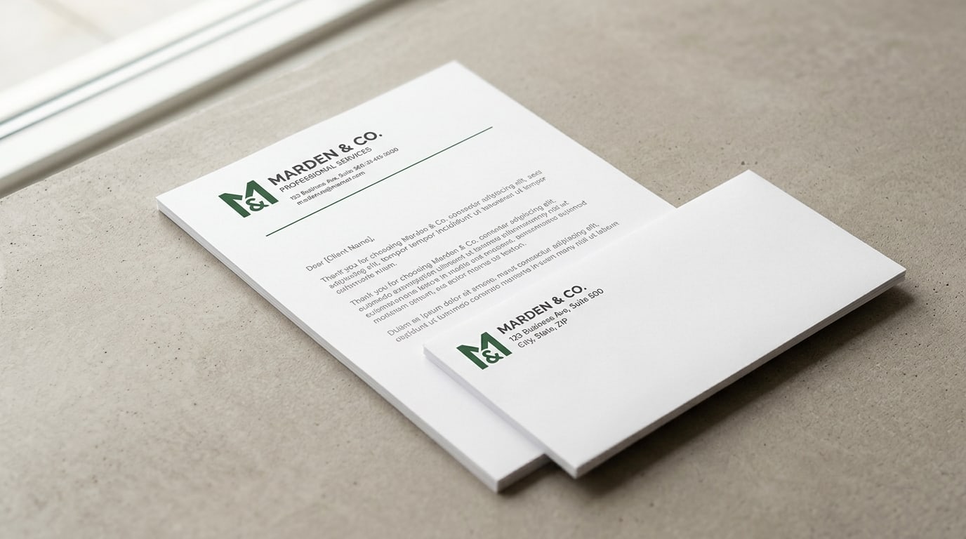
Letterhead and envelopes: why the matched set still matters
A working guide to printing letterhead and envelopes as a matched set — stock choices, when it's worth it, the per-piece math, and how to keep both pieces looking like they belong together.
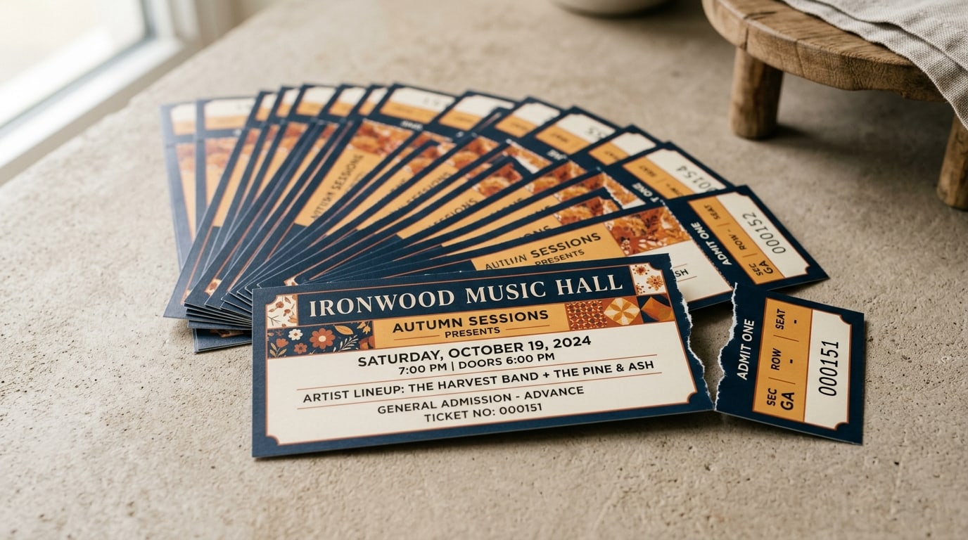
Event tickets: numbering, perforation, and keeping the gate honest
A working guide to printed event tickets — when sequential numbering matters, how perforated stubs control the door, and which security features actually earn their cost.
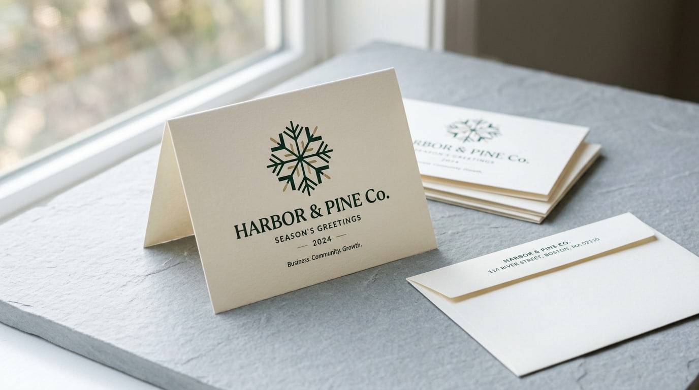
Greeting cards for businesses: holiday outreach that actually gets kept
A working guide to business holiday greeting cards — why a printed card outperforms an email blast, when to order, stock and finish choices, and how to write one clients keep.