Trifold vs bifold brochures: how to choose the right fold
A working guide to trifold vs bifold brochure layouts — what each fold does to your content, where each one wins, and how to set up the panels correctly.
When you order a brochure, the fold is not a cosmetic choice — it’s the information architecture of the piece. A trifold and a bifold printed on the same 8.5x11 sheet hold the same square inches, but they read completely differently, hand out differently, and suit different kinds of content. Picking the fold before you design saves you from the most common brochure mistake: writing the content first and then discovering it doesn’t fit the panel structure.
Here’s the working guide.
The short version
- Trifold gives you six narrow panels and a guided, step-by-step reading order. It’s the right call for service menus, sequential pitches, and anything that gets handed out, racked, or mailed.
- Bifold gives you four wide panels and one big open spread. It’s the right call for image-driven content — portfolios, product showcases, event programs — where the payoff is the moment the piece opens flat.
If your content is a list of things (services, steps, FAQ), trifold. If your content is one big thing (a product, a property, a venue), bifold.
What a trifold actually does to your content
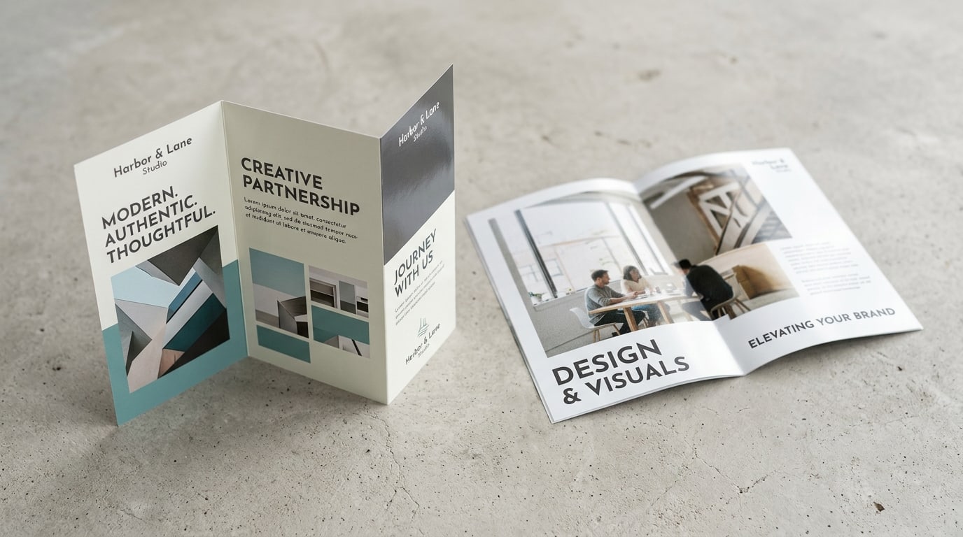
A standard trifold takes an 8.5x11 sheet and folds it twice into a 3.667x8.5 finished piece. That gives you six panels, each tall and narrow — and crucially, the reader encounters them in a fixed sequence: cover, inside flap, then the three-panel inside spread, then the back.
That sequence is the trifold’s superpower. You control the reveal:
- Cover panel — one headline, one image, one reason to open it. Nothing else.
- Inside flap (the panel the reader sees first when they open the cover) — your setup: the problem you solve, your positioning, a short intro.
- Three-panel inside spread — the body: services, packages, process steps, menu items. The narrow columns force you into scannable chunks, which is a feature.
- Back panel — contact info, map, hours, social. The boring-but-necessary block.
The narrow panels punish long paragraphs. If your copy is dense — long case studies, big spec tables, wide photography — the trifold will fight you on every panel. That’s the signal to go bifold.
Where the trifold wins on logistics: the finished 3.667x8.5 size fits a standard #10 envelope without extra folding, fits literature racks, and slips into a pocket or bag. If your brochure’s life is being handed across a counter, stuffed in an envelope, or sitting in a rack next to twenty competitors, the trifold format exists for exactly that. Our tri-fold brochures run on gloss or matte text and cover stocks with the scoring done right, so the folds are crisp instead of cracked.
What a bifold actually does to your content
A bifold (half-fold) takes the same 8.5x11 sheet and folds it once into a 5.5x8.5 finished piece — four panels, each nearly twice as wide as a trifold panel. The reading experience is closer to a small magazine: cover, then one big inside spread, then the back.
That inside spread is the whole argument for the bifold. When the piece opens, the reader sees a full 8.5x11 canvas with a single fold line through the middle. You can run a hero image across both panels, lay out a floor plan, show a product line in a proper grid, or present a single offer with real breathing room. Nothing in the trifold world can do that.
Bifold is the right call when:
- The piece is image-led — interior design portfolios, real estate listings, restaurant or venue showcases, lookbooks
- You’re presenting one offer in depth rather than many offers in brief
- The brochure supports a conversation — sales meetings, consultations, trade-show talks — where someone opens it flat on a table
- You want the piece to read premium: the wider panels and magazine-like format signal more substance than a rack fold
The trade-offs: a 5.5x8.5 finished piece doesn’t fit a #10 envelope (it needs a 6x9), it doesn’t fit most literature racks, and with only four panels you have less room for structured lists. A bifold with twelve services crammed onto the spread looks worse than the same content in a trifold. Our half-fold brochures are the standard format here, and heavier cover-weight stock is worth considering if the piece will be handled in meetings rather than mailed.
The third option people forget: the Z-fold
Same sheet, same two folds as a trifold — but folded in alternating directions so the piece zigzags open instead of nesting. Two things change:
- The whole inside opens flat in one pull. No flap to lift, so the three inside panels read as one wide canvas — a middle ground between trifold structure and bifold openness.
- Panels are all the same width. A nested trifold needs its fold-in panel slightly narrower; a Z-fold doesn’t, which makes the layout grid simpler.
Z-folds shine for step-by-step content that benefits from being seen all at once — timelines, before/during/after sequences, maps. If your trifold layout keeps wanting the three inside panels to merge into one image, that’s a Z-fold brochure, not a trifold.
Panel setup: the part that ruins brochures
Whichever fold you pick, the file setup is where brochures go wrong:
- Trifold panels are not equal widths. The panel that folds inside must be about 1/16” to 1/8” narrower than the other two, or the piece won’t close flat and the fold-in edge will buckle. Use the fold template from the product page rather than dividing 11 inches by three.
- Nothing important on the fold lines. Keep type at least 0.25” away from every fold. Ink cracking at the fold is most visible exactly where you put that clever headline across two panels.
- Design panel-by-panel, in reading order. Mock it up: fold a blank sheet of paper, number the panels, and check that your content lands where the reader’s eyes will actually be at that moment.
- Standard bleed rules apply — 0.125” bleed, safe area inside trim. If you want the full pre-flight rundown, see our print file checklist.
Heavy solid-ink coverage across a fold cracks on thicker stocks. If your design floods color over the fold lines, gloss text stock folds cleaner than cover stock — or ask about scoring, which is included on cover-weight brochure runs for exactly this reason.
Quick recommendation matrix
- Service menu, price list, multi-step process → trifold
- Rack display, envelope mailing, counter handout → trifold
- Portfolio, lookbook, property or venue showcase → bifold
- One product or offer, presented in depth → bifold
- Sales-meeting leave-behind that opens on a table → bifold
- Timeline, map, or sequence that wants one wide canvas → Z-fold
- Twelve services and dense copy → trifold — or honestly, a small booklet instead
Where to start
Decide the fold from the content, not the other way around: list what the brochure has to say, sketch it onto folded scrap paper, and the right format usually announces itself. Then pick the stock — gloss text for handout volume, matte or cover weight for pieces that need to feel substantial in the hand.
Both formats, plus Z-folds and specialty folds, live in the Marketing Products collection with live pricing across every stock, coating, and quantity. And if you’re building out a full campaign around the brochure, the blog index has working guides on postcards, rack cards, and the rest of the print toolkit.
More on Marketing Products
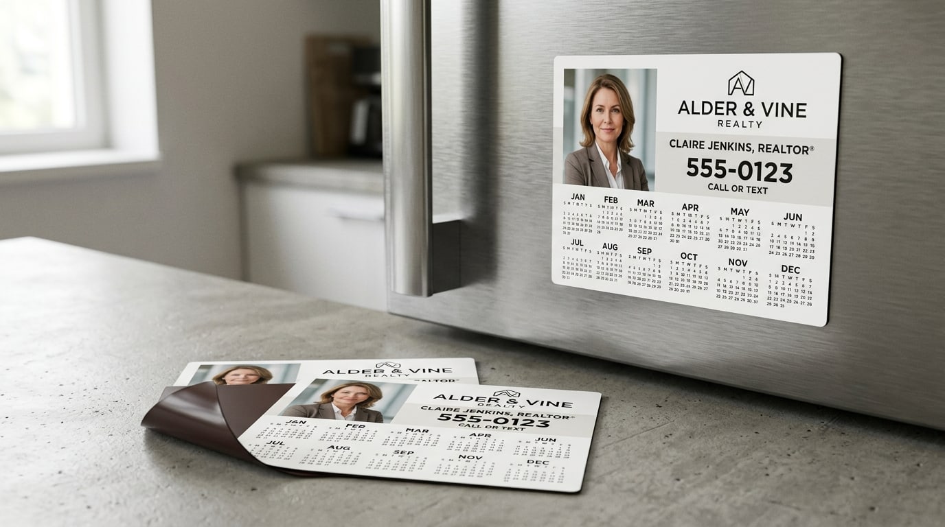
Refrigerator magnets for real estate: the farming tool that outlives the postcard
A working guide to refrigerator magnets for real-estate agents — why calendar magnets beat postcards on cost-per-impression, what size and thickness to spec, and how to design one that gets kept.
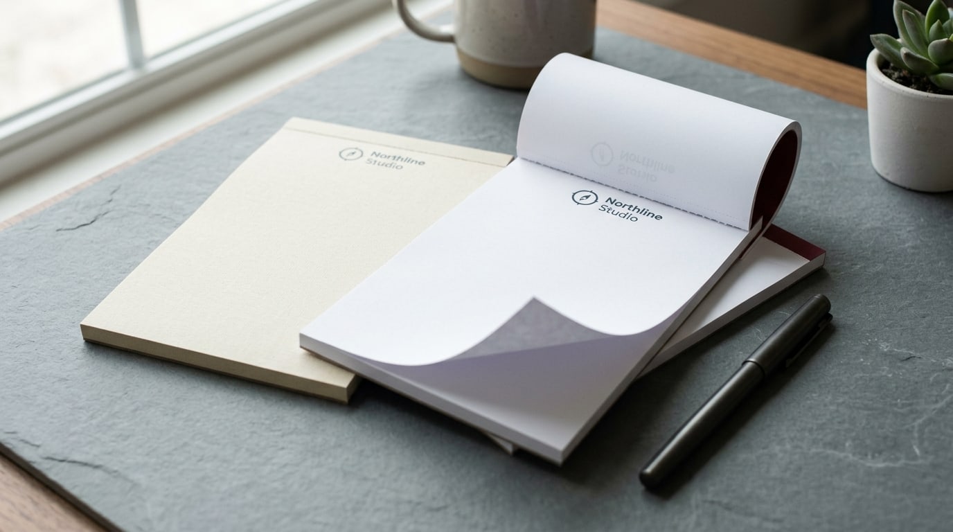
Branded notepads vs. generic: the client gift that actually gets used
A working guide to branded notepads as client gifts — why they beat generic pads, the stock and size decisions, the per-pad math, and when to skip them.
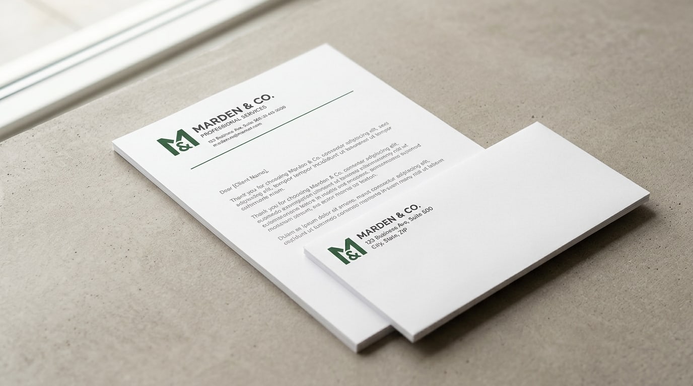
Letterhead and envelopes: why the matched set still matters
A working guide to printing letterhead and envelopes as a matched set — stock choices, when it's worth it, the per-piece math, and how to keep both pieces looking like they belong together.