Sell sheets: one page vs two page, and how to choose
A working guide to one-page vs two-page sell sheets — what each format can hold, where each one wins, how to lay out a sales sheet that gets read, and which stock to print it on.
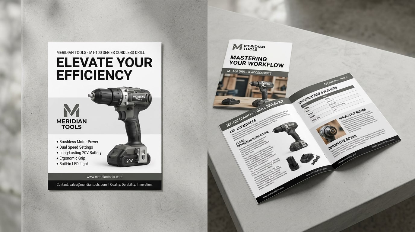
A sell sheet has one job: explain a single product, service, or offer well enough that the person holding it can say yes or pass it up the chain. It’s the piece a rep leaves behind, the page a distributor files, the handout that goes in the folder at a trade show. And the first real decision — before layout, before copy — is how much paper the offer actually needs: a single page, or a folded two-page piece.
People get this backwards constantly. They write everything they know about the product, then go looking for a format that fits the wall of text. Do it the other way. Decide what the sheet has to accomplish, then pick the page count that serves it. Here’s the working frame.
The short version
- One-page sell sheet (a single flat sheet, usually printed both sides) is the default. It forces discipline, it’s cheap to print and reprint, and it fits a folder, an envelope, and a PDF email attachment without fuss. Most products only need this.
- Two-page sell sheet (a folded piece — a half-fold gives you four panels) earns its keep when the offer is genuinely complex: multiple SKUs, a spec table plus application notes, a before/after case, or a product that needs to be shown in use before the numbers make sense.
- Rule of thumb: if you can make the case in one strong front and a supporting back, print one page. If the back is overflowing and you’re shrinking type to fit, that’s the signal to fold.
What a one-page sell sheet is built to do
A one-page sheet is a forcing function. You get a front and a back — that’s it — and the constraint is the point. The discipline of fitting your pitch onto two sides produces a tighter, more readable piece than a four-panel brochure where the temptation is to keep talking.
The front of a one-pager carries the whole argument:
- A headline that states the offer, not a clever tagline. The reader should know what this is in two seconds.
- One hero image — the product, the result, or the thing being sold. Sell sheets are visual; a strong product shot does more than a paragraph.
- Three to five benefit points, scannable, in plain language. What it does for the buyer, not just what it is.
- A short proof element — a stat, a logo bar, a one-line testimonial — that makes the claim credible.
The back does the supporting work: specs, sizes, pricing tiers, a short FAQ, and the contact block with a clear next step. Used well, two sides is plenty for the overwhelming majority of products and services.
The logistics are the other reason one page wins by default. A flat 8.5x11 sheet drops into a presentation folder pocket, fits a standard envelope, mails flat, and copies cleanly to a PDF for email — no fold to flatten, no panel order to explain. The standard format here is the common sell sheets product: full-color one or two sides on a clean text or cover stock, priced so reprinting when a price or spec changes never hurts. If you need a heavier, more substantial leave-behind, the same content on a cover-weight flat flyer reads more premium in the hand.
When the offer needs a second page
A two-page sell sheet — folded, so you actually get four panels to work with — is the right call when one page genuinely can’t hold the argument without cramming. The honest test: are you shrinking body copy below readable size, killing white space, or cutting information the buyer needs to decide? If yes, fold it.
The offers that tend to need the extra room:
- Multiple products or configurations. A line of related SKUs, each with its own specs, needs a grid that a single back panel can’t hold cleanly.
- Technical products that need context. When the buyer has to understand how something works before the spec table means anything — equipment, materials, B2B components — the inside spread gives you room to explain, then prove.
- Case-driven sales. A before/after, a results story, or an application walkthrough wants images plus narrative, which is exactly what the inside of a fold provides.
- A combined overview + detail piece. Cover panel sells the concept; inside spread delivers the substance; back panel closes with contact and next steps. One piece does two jobs.
The natural format for a two-page sell sheet is a half-fold (also called a bifold): a single sheet folded once into a 5.5x8.5 finished piece with four panels and one big inside spread. That spread is the whole reason to upgrade — it opens to a full canvas you can run a hero image or a product grid across. Our half-fold brochures are the standard piece for this, and if your content is really a sequence — step one, step two, step three — a tri-fold or Z-fold brochure may structure it better than a half-fold. The brochure-fold guide is worth a read before you commit, because the fold is the information architecture, not a finish.
A caution worth stating plainly: a folded piece is more expensive to produce, harder to file, and slower to update than a flat sheet. Don’t fold to look impressive. Fold because the content demands it.
Laying out a sell sheet that actually gets read
Format aside, most sell sheets fail for the same reason: they’re written for the person who made the product, not the person reading it. A few rules that hold regardless of page count.
- Lead with the outcome, not the origin story. The reader cares what the product does for them. Company history goes at the bottom, if at all.
- Make it scannable. Buyers skim sell sheets standing up. Headers, short bullets, and a clear visual hierarchy beat dense paragraphs every time.
- One primary action. Every sell sheet should drive to a single next step — call, scan, visit, request a quote. Competing CTAs split the response.
- Respect the grid. Aligned columns, consistent margins, and real white space read as competence. A cramped sheet reads as a cramped company.
- Put the proof where the doubt is. Next to the boldest claim, place the stat or testimonial that backs it. Proof works best adjacent to the thing it’s proving.
And the production basics that quietly sink otherwise-good sheets: set up full bleed if color runs to the edge, keep critical type inside the safe area, and supply a print-ready PDF. The print file checklist covers bleed, trim, and safe-area setup so the sheet comes back looking like the file you sent.
Stock and finish: match it to the sheet’s life
How a sell sheet feels in the hand signals how seriously to take the offer. Choose stock around where the sheet lives.
- High-volume, frequently updated: A standard text-weight stock on common sell sheets is the right default. When prices and specs change quarterly, you want a sheet cheap enough to reprint without a second thought.
- Leave-behind that has to feel substantial: Step up to a cover weight. A heavier sheet survives the folder, the briefcase, and the desk pile, and it reads as more credible the moment it’s picked up.
- Premium or design-led offers: For sheets representing high-end products — luxury goods, design services, premium B2B — a specialty finish does real work. A silk sell sheet adds a soft, low-glare coating that makes photography look richer and feels expensive between the fingers; it’s the difference between a handout and a piece someone keeps.
The economics favor not cutting the stock. You’re paying to design, print, and distribute the sheet; the per-sheet paper upgrade is the smallest line in that budget and the most visible to the buyer holding it.
Quick recommendation matrix
- Single product or service, clear pitch → one-page sell sheet, two sides (common sell sheets)
- Premium offer, needs to feel high-end → one-page on a silk or cover-weight stock
- Multiple SKUs, spec tables, or a case story → two-page half-fold
- Step-by-step or sequential content → tri-fold or Z-fold (fold guide)
- Substantial leave-behind for a folder → cover-weight flat flyer
Where to start
Start from the offer, not the format. If your product can be sold on a strong front and a supporting back, print a one-page sell sheet — it’s cheaper, easier to update, and fits everywhere. Reach for a folded two-page piece only when the content genuinely overflows one sheet. Browse live pricing on the common sell sheets product, step up to a silk sell sheet where the offer needs to feel premium, and see the rest of the brochures and folders in the Marketing Products collection. For more guides on picking the right print format, the blog index covers brochure folds, postcard sizes, and presentation folders.
More on Marketing Products
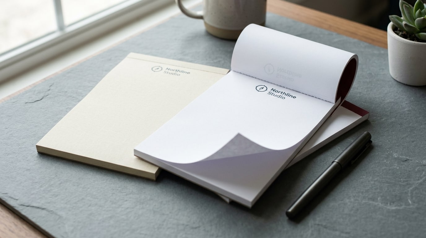
Branded notepads vs. generic: the client gift that actually gets used
A working guide to branded notepads as client gifts — why they beat generic pads, the stock and size decisions, the per-pad math, and when to skip them.
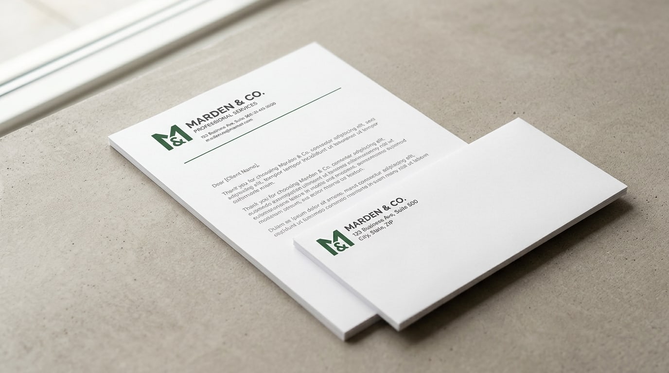
Letterhead and envelopes: why the matched set still matters
A working guide to printing letterhead and envelopes as a matched set — stock choices, when it's worth it, the per-piece math, and how to keep both pieces looking like they belong together.
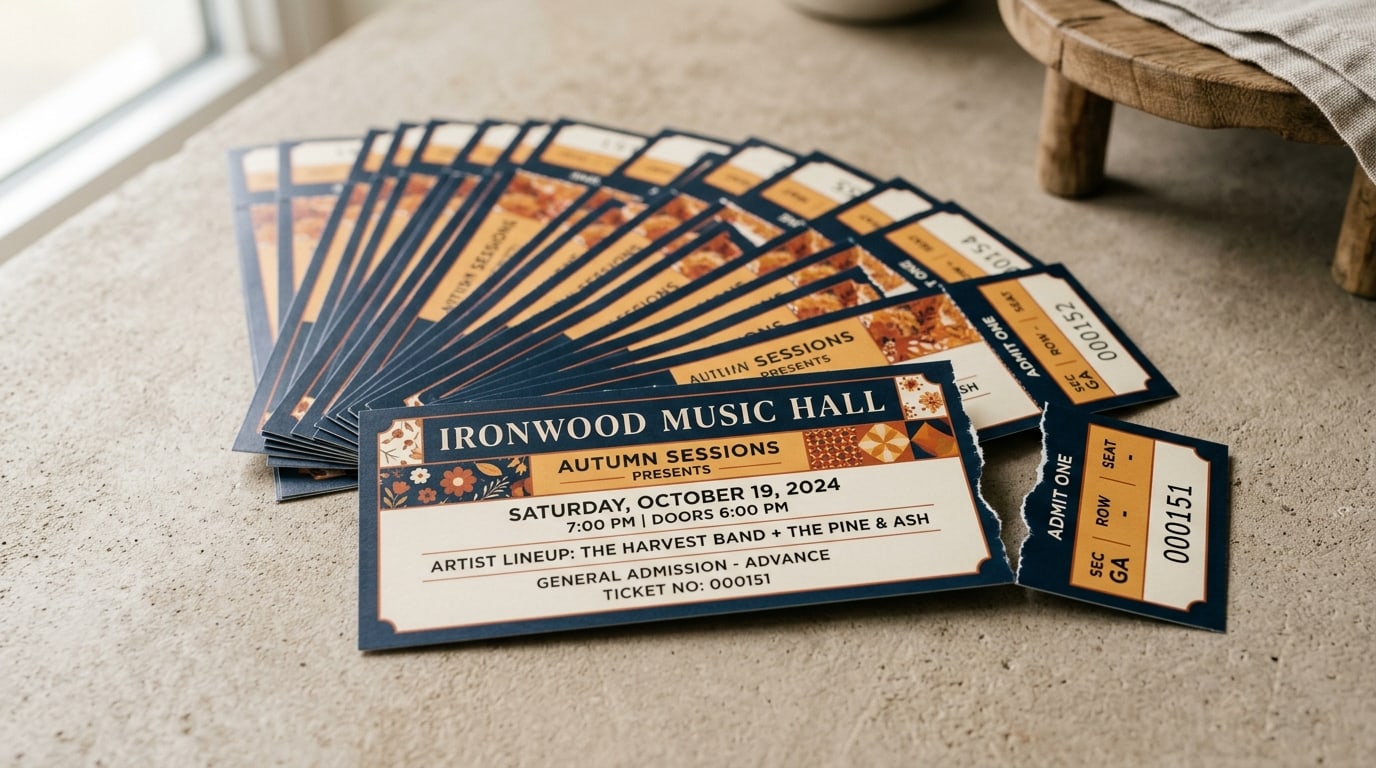
Event tickets: numbering, perforation, and keeping the gate honest
A working guide to printed event tickets — when sequential numbering matters, how perforated stubs control the door, and which security features actually earn their cost.