Pearl business cards: subtle shimmer that fits weddings and luxury events
A working guide to pearl business cards — what the pearlescent finish actually does, when shimmer reads elegant instead of cheap, and which brands it fits best.
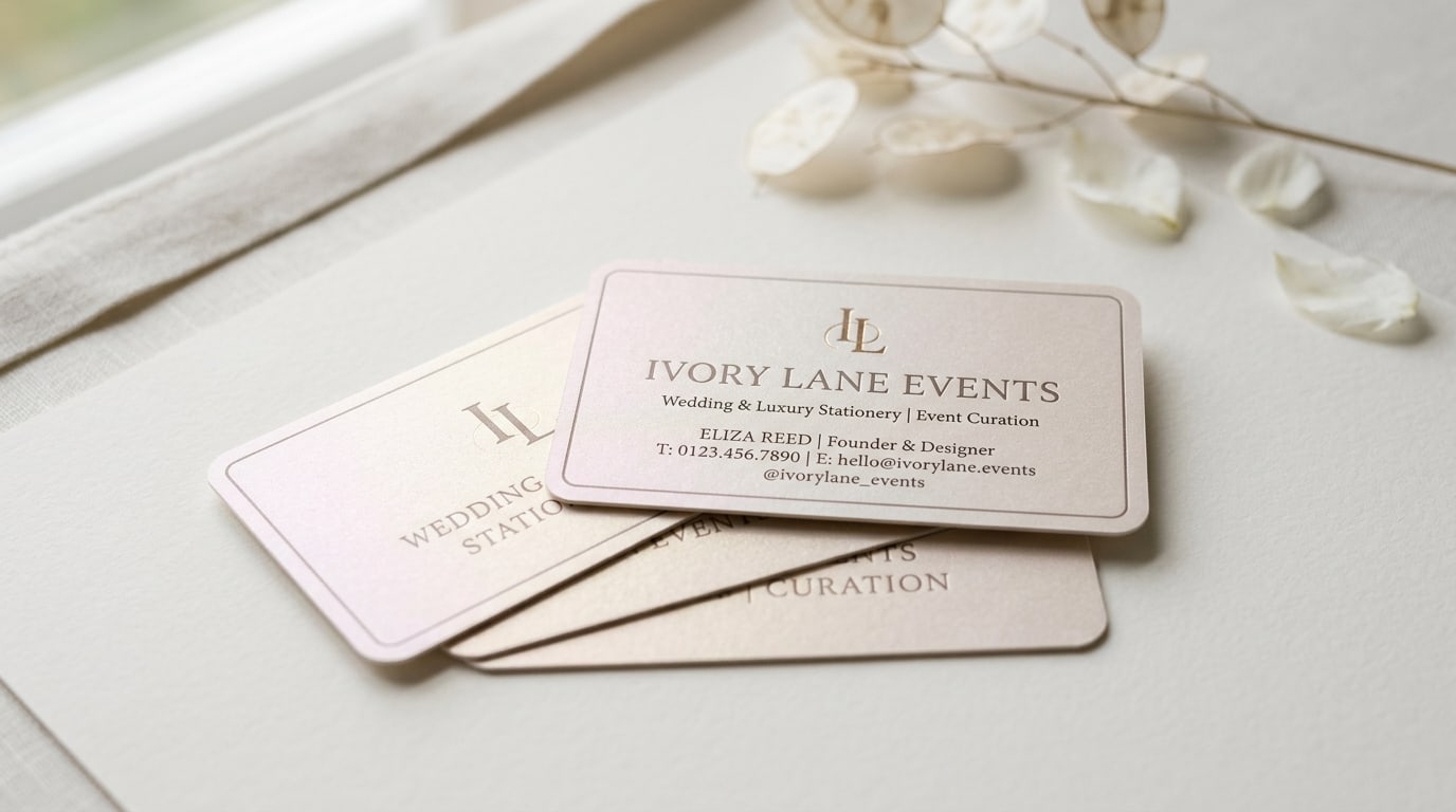
Pearl business cards are the quietest way to put shimmer on a card without it looking like a nightclub flyer. The finish isn’t a foil stamp or a glitter coat sitting on top of the artwork — it’s a pearlescent sheen baked into the stock itself, so the whole card catches light with a soft champagne-and-rose glow that shifts as it moves. Held still, the card just looks like elegant cream paper. Tilted toward a window, it lights up.
That restraint is exactly why it’s the default for wedding planners, stationers, and luxury-event brands, and exactly why it’s the wrong call for a plumbing company. Here’s a working guide to what the finish does, when shimmer reads as expensive rather than tacky, and how to keep it from fighting your design.
What “pearl” actually is
It helps to separate pearl from the other shiny finishes people confuse it with.
Pearl is a coated stock with a pearlescent pigment built into the surface layer. The shimmer comes from the paper, not from anything applied afterward. That means the effect is uniform across the entire card — face, back, every edge — and it’s continuous rather than localized. There’s no raised texture and nothing sitting proud of the surface; run a fingernail across it and it feels smooth.
That’s the key difference from the finishes it gets lumped in with:
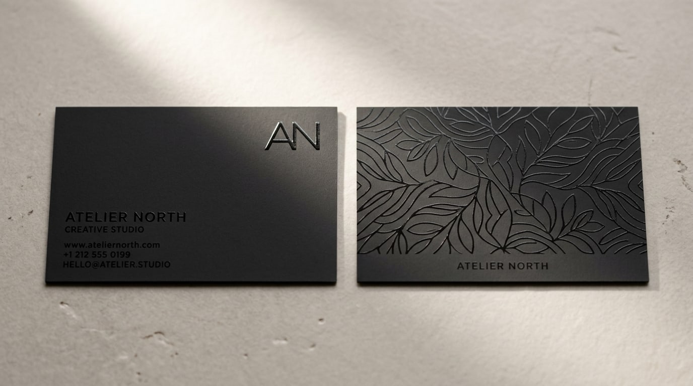
- Foil (like Raised Foil Business Cards) is a solid metallic layer pressed onto specific areas — a logo, a name. It’s localized, mirror-bright, and tactile.
- Akuafoil Business Cards combine selective metallic shimmer with full-color print, so the sparkle lands only where you place it and can be wild and high-contrast.
- Pearl is the opposite of selective — it’s a whole-card glow that’s deliberately understated. It whispers where foil shouts.
If you’ve ever held a wedding invitation that seemed to softly luminesce under candlelight, that’s the pearl family. It reads as “good paper” before it reads as “shiny.”
Where pearl wins
The finish quietly outperforms the standard options for a specific cluster of brands:
Wedding planners, stationers, and calligraphers. This is pearl’s home turf. The pearlescent glow matches the visual language of save-the-dates, invitation suites, and place cards, so a planner’s business card feels like part of the same world the client is buying into. A matched look across the card and the event stationery is a selling point, not a coincidence.
Florists, event designers, and luxury caterers. Anyone whose work is photographed for Instagram and Pinterest benefits from a card that photographs as soft and high-end. Pearl reads beautifully in the warm, diffused light those vendors already work in.
Bridal boutiques, jewelers, and salons handling above-average ticket prices. When the card is the first physical object a client takes home, the shimmer sets the perceived value of everything that follows.
Boutique hospitality and spa brands. Pearl signals “indulgent” without the corporate hardness of metallic foil. It pairs naturally with soft, neutral palettes.
You can order Pearl Business Cards directly when those constraints fit. The finish also lives in the broader Majestic Products specialty lineup alongside the other premium stocks.
Where pearl loses
It’s not a universal answer. Skip pearl when:
- The brand is supposed to read modern, technical, or corporate. SaaS, fintech, law, accounting, and B2B consulting almost always want a flatter, more “screen-correct” surface. Shimmer on those cards reads as a mismatch. Standard Business Cards in matte or soft-touch represent that world better.
- Your design depends on punchy, saturated color. The pearlescent layer slightly mutes and warms ink, so a bright coral or electric teal will read softer and a touch creamier than it does on a clean coated white. That’s flattering for blush, taupe, sage, and gold, and unflattering for high-chroma brand colors.
- You need a crisp full-bleed photograph. Photos on pearl pick up the surface sheen, which can flatter a soft styled image and undercut a sharp product shot. If the back of the card is a headshot or a vivid product photo, test it before committing.
- You hand out cards in high volume to inattentive recipients. At a trade show dropping 500 cards a month, the marginal recipient won’t register the shimmer, and the upgrade isn’t earning its cost. Save the premium for the contexts where the card is handled slowly.
Keeping the shimmer from fighting the design
Most pearl cards that look cheap got there one of three ways. A few rules of thumb keep it on the elegant side of the line.
Let the paper do the shimmering — not the ink. The mistake is pairing pearl stock with metallic-look inks or a busy gradient. Now you have two competing sheens and the card looks confused. Pearl works best with flat, restrained ink: a single deep neutral (charcoal, taupe, ink-blue) or a soft two-color palette, set against generous white space so the glow reads as the premium element.
Favor light and neutral over dark and heavy. Pearl’s sheen is most visible across light, open areas. A card that’s 90% dark ink coverage buries the effect — you’ve paid for a finish you can barely see. Cream, blush, ivory, and pale grey faces let the shimmer breathe.
Keep type elegant and not too small. The slight warmth of the coating can soften very fine hairline type. Refined serifs, tasteful spacing, and type at or above roughly 7-8pt hold up cleanly; ultra-thin 5pt weights can lose crispness into the sheen.
Match the corners to the mood. Rounded corners push a pearl card further into soft, wedding-and-luxury territory; square corners keep it slightly more formal. Both are available on the Pearl Business Cards product page.
If you want help getting artwork print-ready — bleed, trim, and safe area are stricter on premium stocks — the print file checklist covers the basics in about five minutes.
Pearl vs the other premium finishes
A working comparison if you’re choosing between specialty stocks:
| If you want… | Pearl | Raised Foil | Akuafoil | Silk / Suede |
|---|---|---|---|---|
| Whole-card subtle glow | Best | No (localized) | No (localized) | No (matte/soft) |
| Loud metallic statement | Weak | Strong | Strong | Weak |
| Wedding / luxury-event fit | Best | Good | Situational | Good |
| Tactile texture you can feel | Smooth | Raised | Smooth-ish | Soft texture |
| Photographs soft and high-end | Strong | Medium | High-contrast | Medium |
| Reads modern / corporate | Weak | Medium | Medium | Medium |
If you can’t decide between pearl and a foil option, the question to ask is: should the shimmer be everywhere, or only on the logo? If the answer is “the whole card should feel luminous,” that’s pearl. If it’s “I want one element to gleam and the rest to stay matte,” that’s Raised Foil or Akuafoil.
And if the brand wants premium feel without any shine at all — a velvet-soft touch instead of a glow — that’s Silk or Suede Business Cards territory, or the warmer, textured route of Linen Uncoated Business Cards.
Quick recommendation matrix
A working frame for picking it:
- Wedding planner, stationer, calligrapher → pearl, charcoal or taupe ink on cream
- Florist, event designer, luxury caterer → pearl, soft two-color palette, lots of white space
- Bridal boutique, jeweler, upscale salon → pearl, minimal type, rounded corners
- Boutique hotel or spa → pearl in a soft neutral, or Suede Business Cards if you’d rather feel than shine
- High-volume B2B sales → skip pearl, use Standard Business Cards in matte
- Brand built on bold saturated color → skip pearl, use a clean coated standard so the color stays true
- Brand that wants one element to gleam, not the whole card → Raised Foil or Akuafoil
Where to go from here
Pearl is one of those finishes that’s hard to judge from a screen and easy to judge from a stack in your hand — the shimmer only fully reveals itself when it moves under real light. If it fits the brief, place a small starter order, set the cards on a table near a window, and watch how they catch the light. You’ll know within a day whether the glow is doing the work for the brand.
Compare it against the rest of the lineup in the business cards collection, browse the specialty stocks in Majestic Products, or head to the blog for guides on the other finishes — painted edge, Akuafoil, linen uncoated, and the standard coatings all live in their own posts.
The short version: pearl is what you reach for when the brand should feel luminous and expensive without saying a word about it — when the card belongs in the same world as the invitation suite, and “good paper” should be obvious before anyone reads the type.
More on Business cards
Slim business cards: when the half-height 1.75" x 3.5" format actually works
A working guide to slim half-height business cards — when the long narrow format helps your brand, when it gets in the way, and how to design for it.
Square business cards: when the 2.5" format fits your brand (and when it doesn't)
A working guide to square 2.5" x 2.5" business cards — when the non-standard format helps you stand out, when it gets in the way, and how to design for it.
Spot UV business cards: subtle accent vs full-coverage pattern
A working guide to spot UV business cards — when a single glossy element does more for your brand than full coverage, and when the pattern approach actually pays off.