Slim business cards: when the half-height 1.75" x 3.5" format actually works
A working guide to slim half-height business cards — when the long narrow format helps your brand, when it gets in the way, and how to design for it.
A slim business card is the easiest non-standard format to get right. It keeps the 3.5” width of a normal card — so it still slides into a wallet — but cuts the height roughly in half, to 1.75”. Hand someone a slim card and the first thing they notice is the proportion: long, narrow, deliberate. The second thing they notice is that it still fits where their cards normally live. That combination is why the format works when it works, and why it’s a worse fit than people expect when it doesn’t.
This guide is for anyone deciding whether a slim card helps the brand or just makes the cards harder to design. There are categories where the half-height format earns its keep, categories where it fights what the card needs to do, and a short list of layout rules that separate the good ones from the ones that look squeezed.
What a slim business card actually is
A slim business card on the Rectangle Business Cards spec sheet is 1.75” x 3.5” — exactly half the height of a standard 3.5” x 2” card, with the same width. The surface area drops to about 6.1 square inches vs 7 on a standard card, which is close enough that you don’t really notice the lost real estate until you try to lay out two columns of contact info.
The format is sometimes called “slim,” “half-height,” “skinny,” or just “rectangle” depending on the catalog. It’s the same physical card.
What you trade by going slim:
- You keep wallet fit. Slim cards drop into a billfold or cardholder cleanly — same width as standard, just shorter on the long edge. This is the single biggest reason slim outperforms square for cards that need to live in a wallet.
- You give up layout flexibility on the back. The shorter dimension takes a real bite out of how much text you can stack. A standard card fits a 5-line contact block easily; a slim card forces you to two lines, three at most, before it starts looking cramped.
- You change the reading rhythm. Slim cards read horizontally, like a banner. The eye scans left to right and stops. There’s no real vertical hierarchy because there’s no vertical room — the layout has to commit to a single horizontal flow.
Slim cards print on the same paper stocks as standard ones — 14pt, 16pt, soft-touch, matte, gloss, uncoated — and accept the premium finishes: spot UV, foil, Akuafoil, painted edge. The shape choice sits on top of those decisions, not instead of them.
When the slim format works
Slim cards earn their format when the card is doing one specific job rather than five. The strongest categories:
- Personal trainers, yoga instructors, and fitness coaches. A slim card reads as “stripped-down and confident” — which matches the brand category. Name, specialty, phone, and a clean wordmark fit comfortably; you don’t need three certifications on the back.
- Bartenders, sommeliers, mixologists, and hospitality staff with personal cards. The horizontal-banner feel matches drinks-menu and tasting-card aesthetics. Slim cards slipped into a bill folder or set on the bar read as part of the room.
- Independent stylists, colorists, and personal-service professionals. When the card is essentially a name + booking link + Instagram handle, the slim format does more brand work than a half-empty standard card.
- Authors, speakers, and creatives with a single calling card. A slim card with a strong wordmark, a short tagline, and one URL outperforms a standard card padded with three social handles.
- Modern restaurant and bar concepts as house cards. Slipped into the check folder with the receipt, slim cards read as deliberate. The horizontal proportion mirrors a check.
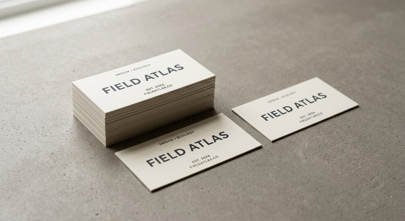
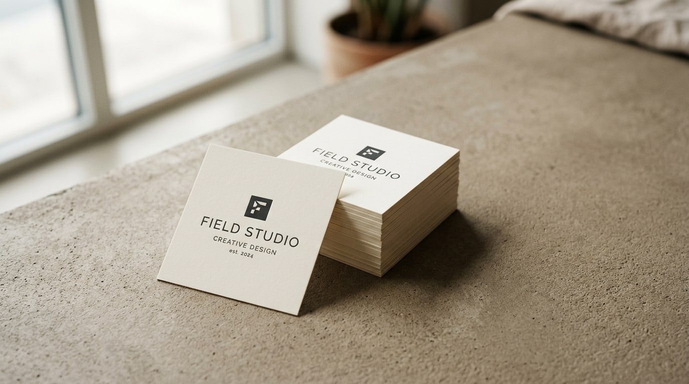
- Designers, illustrators, and creative studios. A slim card with a single oversized logotype works because the format gives the wordmark room to breathe horizontally instead of fighting a vertical layout.
- Loyalty cards, appointment reminder cards, and gift-with-purchase cards. When the card is doing one thing — a stamp grid, a date written in, a QR — the slim format reads as a deliberate object rather than a standard card pretending.
A useful test: write down everything you want on the card. If it fits comfortably on two horizontal lines per side, slim is fine. If you’re already past three lines, you’re going to fight the format the whole way.
When the slim format gets in the way
The half-height proportion is wrong for several common card jobs. Skip slim when:
- You need a dense contact block. B2B sales reps, attorneys, financial advisors, and account managers usually carry a card with name, title, firm, phone, mobile, email, and website. That stack does not fit cleanly on a 1.75” tall back. Use Standard Business Cards instead.
- Your audience expects a traditional card. Legal, traditional financial services, executive search, conservative B2B — these audiences read non-standard formats as marketing rather than as professionalism. The novelty cuts against trust.
- The card has to feature a headshot or full-bleed photograph. Real estate agent cards, headshot-driven personal-brand cards, and photographer self-promo cards all need vertical room a slim card doesn’t have. Headshots cropped to 1.75” tall look severe.
- You hand out high volumes at trade shows. Standard rectangular cards stack into card cases, fit hotel rack-card slots, and behave the way trade-show booth visitors expect. Slim cards interrupt that flow — not a disaster, but friction at scale.
- The card doubles as a referral card or appointment card with writing room. If you need a 4-line stamp grid or a “next appointment: ___” block plus a back-side info panel, you’ll run out of room on slim before you run out of content.
The honest version: a slim card is a brand decision, not a printing one. If your brand reads as restrained, modern, personal-service, or design-forward, and you can express the card in one horizontal sentence per side — slim fits. If your brand needs to communicate a dense set of credentials, services, or contact details — slim works against you.
Designing for the half-height format
A few rules of thumb that separate slim cards that land from slim cards that look like a normal layout got cropped:
Commit to the horizontal reading flow. A slim card reads like a single line, left to right. Logo on the left, contact stack on the right is the natural arrangement. Trying to center-anchor it usually fails — the format wants a directional read.
One focal point per side. The back of a slim card is almost always wasted when designers try to repeat the front. Better: front side is the brand mark and one anchor line; back side is contact info, a QR, or a single call to action. Each side does one thing.
Type runs long, not stacked. A slim card is a poster, not a paragraph. Use it for a horizontal logotype that wouldn’t get room to breathe on a square or rectangular card. Tall stacked typography looks pinched.
Skip the headshot. A 1.75” tall headshot crop almost always looks awkward — eyes too close to one edge, hair cropped at the top, nothing breathing. If your card needs a photo, you need a different format.
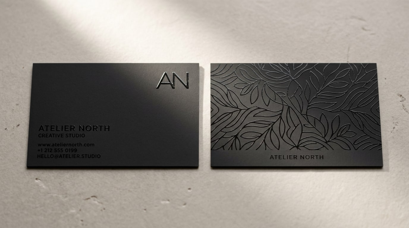
The card edge matters more than usual. The slim proportion already reads as a deliberate choice, so what you do at the edge becomes part of the conversation. Painted edge on a slim card reads as fully premium without screaming. Round corners on a slim card read as friendly and approachable — useful for hospitality and personal-service brands. See Painted Edge Business Cards for the available edge color list if you want to layer that on.
Premium finishes still work. Slim + soft-touch matte is a strong combination — the long narrow proportion plus a tactile surface reads as quietly upscale. Slim + raised foil works when the foil element is one horizontal logotype rather than a full-coverage pattern. Slim + Akuafoil works when the metallic element is restrained — a small mark, not a wallpaper pattern. The post on foil finishes covers the trade-offs across the three metallic options.
File prep notes worth knowing
A few things that trip people up on a slim spec sheet:
Final trim size is 3.5” x 1.75”. Set your artboard to 3.625” x 1.875” to include 0.0625” (1/16”) of bleed on every side. Keep critical type and your logo inside a 3.25” x 1.5” safe area. The full bleed, trim, and safe area checklist covers the standard margins.
The safe area is the constraint, not the trim. The vertical safe area on a slim card is only 1.5”. That’s the real working canvas. Plan the layout against 1.5” tall first, then add bleed.
Minimum type size matters more. Because the card is half-height, the temptation is to shrink type to fit more content. Resist it. 7-8pt is the practical minimum for body lines; below that, type loses legibility under most lighting conditions. If you can’t fit the content at 8pt, you have too much content for the format.
Horizontal orientation is the only orientation. Slim cards technically print in either direction, but a vertical 1.75” wide slim card reads like a bookmark, not a business card. Stick with horizontal.
Quantities work the same as standard cards. Most slim card jobs are 250, 500, 1,000, or 2,500. The per-card cost drops at the same break points as rectangular cards, and the upcharge over standard is small.
Slim vs square vs standard: a quick framework
If you’re trying to choose between the three rectangular shape options:
- Standard 3.5” x 2” — Maximum content capacity. Maximum recipient familiarity. Maximum wallet fit. The default for a reason.
- Slim 3.5” x 1.75” — Keeps wallet fit, sacrifices content capacity for horizontal-banner aesthetics. Best for personal-service, hospitality, and single-focal-point cards.
- Square 2.5” x 2.5” — Sacrifices wallet fit for the most deliberate format. Best for cards that will sit on counters and desks, not get pocketed. See the square business cards guide for the full breakdown.
If the card needs to live in a wallet, slim or standard. If the card needs to sit on a surface, square or slim. If the card needs to carry a dense contact block, standard is the only honest answer.
Quick recommendation matrix
A working starting point for whether slim fits:
- Personal trainer, yoga instructor, coach → slim cards, soft-touch matte, single horizontal wordmark
- Bartender, sommelier, hospitality staff → slim cards, brand-aligned dark stock
- Stylist, colorist, personal-service pro → slim cards, Silk or soft-touch finish
- Author, speaker, single-purpose calling card → slim cards, oversized horizontal wordmark
- Modern restaurant or bar house card → slim cards, painted edge or Painted Edge Business Cards for the premium version
- Designer or creative studio → slim cards, minimal type, optional painted edge or Akuafoil Business Cards
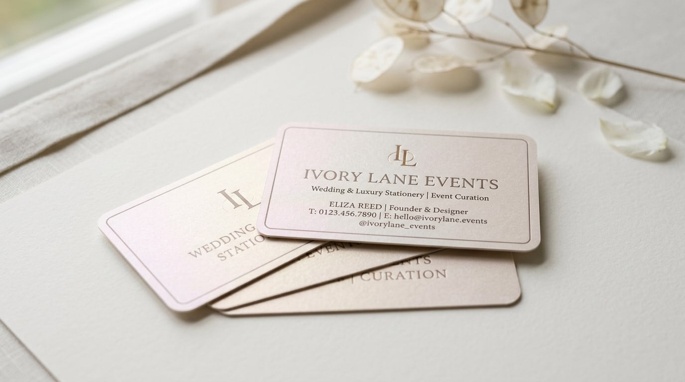
- Wedding planner with single-tagline card → slim cards, Pearl Business Cards stock
- B2B salesperson, attorney, traditional advisor → Standard Business Cards, not slim
- Real estate agent with headshot card → standard or square, never slim
- High-volume trade-show handouts → standard, save the format change for a personal card
If you’re on the fence, the safer move is to start with a small test run — 250 cards — in the slim format with your top design. The half-height proportion reads very differently in person than it does in a PDF mockup, and seeing how the cards stack, fit in a wallet, and get handed over in real use is the fastest way to know whether the format earns its place.
Where to go from here
Slim cards live in the Business Cards catalog with live pricing on every paper stock and finish. If you’re comparing against the other non-standard shapes — square, oval, leaf, fold-over — those each have their own product page with the same stock and finish options. More format and finish guides live on the BQP blog.
The short version: slim cards are what you reach for when the brand voice fits in one horizontal line, when the recipient is going to pocket the card (not pin it to a corkboard), and when “deliberate” beats “comprehensive.” Most catalogs hide the slim format in the shape submenu. For the right brand, it deserves to be the first option you reach for.
More on Business cards
Pearl business cards: subtle shimmer that fits weddings and luxury events
A working guide to pearl business cards — what the pearlescent finish actually does, when shimmer reads elegant instead of cheap, and which brands it fits best.
Square business cards: when the 2.5" format fits your brand (and when it doesn't)
A working guide to square 2.5" x 2.5" business cards — when the non-standard format helps you stand out, when it gets in the way, and how to design for it.
Spot UV business cards: subtle accent vs full-coverage pattern
A working guide to spot UV business cards — when a single glossy element does more for your brand than full coverage, and when the pattern approach actually pays off.