Square business cards: when the 2.5" format fits your brand (and when it doesn't)
A working guide to square 2.5" x 2.5" business cards — when the non-standard format helps you stand out, when it gets in the way, and how to design for it.
A square business card is the smallest non-standard format you can hand someone without explaining yourself. The 2.5” x 2.5” footprint is close enough to a normal card that nobody asks why it doesn’t fit in a wallet pocket — but different enough from the rectangular 3.5” x 2” default that the recipient notices the shape before they read a single word. That noticing is the whole point, and also the whole risk.
This guide is for anyone deciding whether the square format helps the brand or just makes the cards harder to use. There are categories where square cards land cleanly, categories where they fight what the customer is trying to do with the card, and a handful of design rules that separate the cards that work from the cards that look like they’re trying.
What a square business card actually is
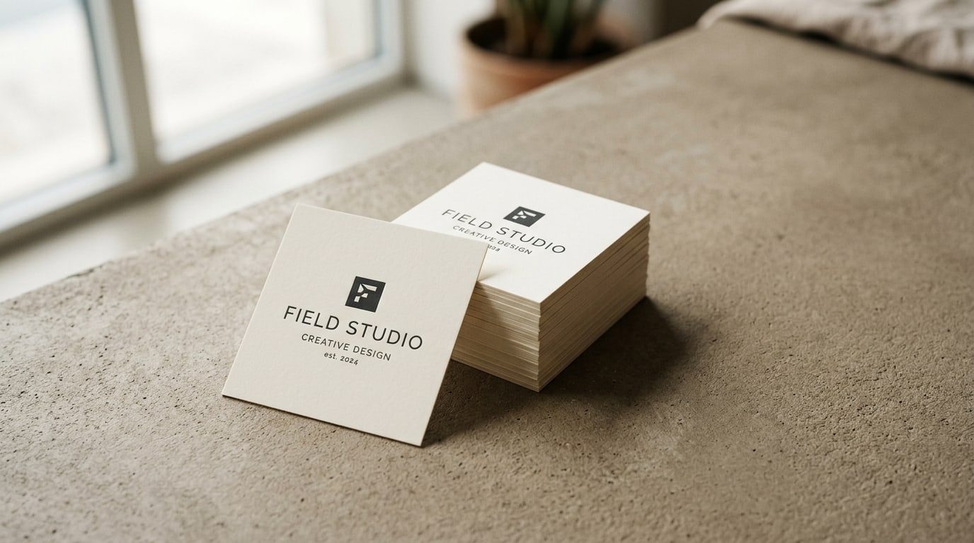
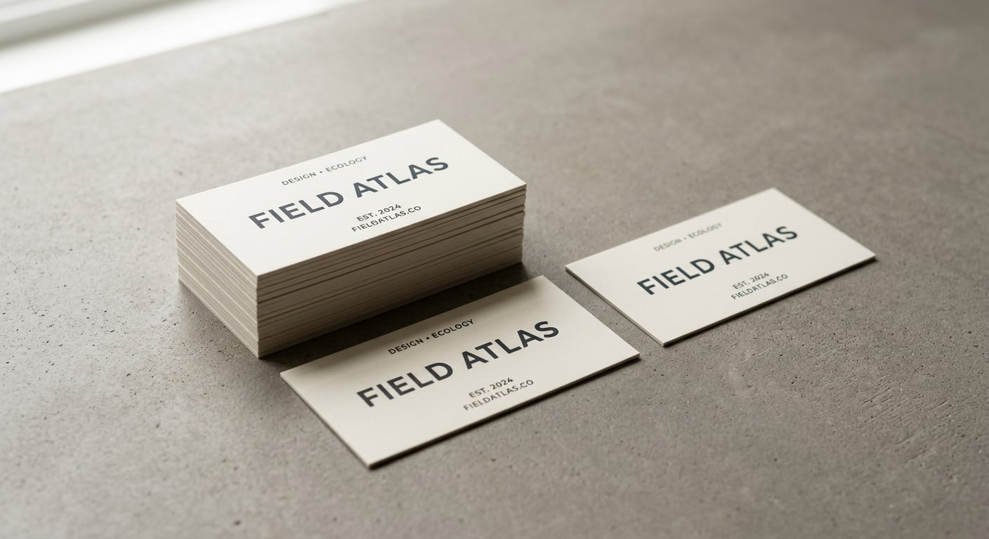
A square business card is, on the Square Business Cards spec sheet, a 2.5” x 2.5” card — about an inch shorter on the long edge than a standard 3.5” x 2” card, and a half-inch taller. The surface area comes out close: 6.25 square inches vs 7 square inches on a rectangle. So you’re not actually losing much room to print on. What you’re trading is the familiar shape recognition.
Square cards print on the same paper stocks you’d expect — 14pt, 16pt, soft-touch laminated, matte, gloss, uncoated. They also accept the premium finishes: spot UV, foil, painted edge, Akuafoil. The choices that matter on standard cards still matter on square ones; the shape change is on top of those decisions, not instead of them.
A few practical things that are different in production:
- Standard wallets don’t fit them cleanly. A square card slides into a card slot, but it sticks out the top. Most people pocket them flat or set them aside in a stack.
- They’re harder to flip in one hand. A rectangular card has an obvious long axis; a square card doesn’t. Recipients usually rotate them 90° trying to find the “right” orientation before they read it.
- Stacks of them sit differently on a desk or counter. The square footprint feels deliberate, almost like a coaster — which is either good for your brand or bad for it, depending on the brand.
That third one is where most of the value lives. A small stack of square cards on a counter, by a register, or on a designer’s desk reads as intentional. Same stack of standard rectangular cards just reads as cards.
When the square format works
Square business cards earn their format when the card is doing more than just delivering a phone number. The strongest categories:
- Hospitality, restaurants, and bars. A square card slipped into the bill folder, set on the bar, or stacked at a host stand reads as part of the design language of the room. It looks like signage shrunk down rather than a generic vendor card. Pair it with a matte or soft-touch finish like Silk and it lands.
- Boutique retail and lifestyle brands. Candle makers, ceramicists, florists, independent fashion lines, gift shops. The brand identity usually already involves square or modular shapes — Instagram tiles, square product photos, square hang tags. A square card extends the visual language instead of breaking it.
- Designers, illustrators, and creative studios. If your portfolio is full of square thumbnails, your card matching that grid feels coherent. Architecture practices and interior designers, too — square reads as planning-document rather than salesperson-document.
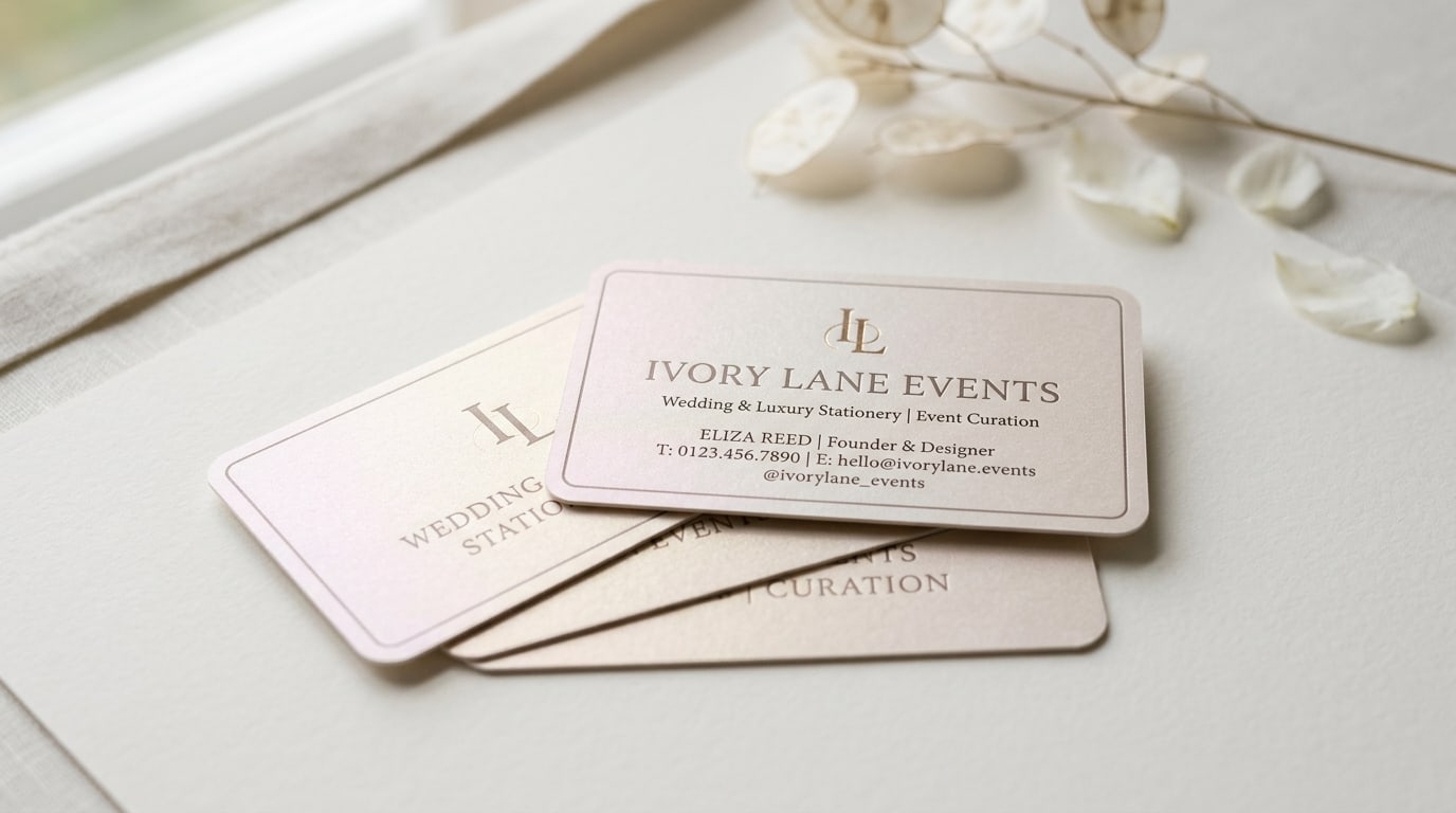
- Real estate brokers with a design-forward identity. Not every realtor card should be square, but the ones marketing modern architecture, vacation rentals, or design-conscious neighborhoods get more mileage from the square format than from the standard rectangle.
- Anyone whose card doubles as a small gift card, loyalty card, or QR-only card. When the card is meant to be presented, scanned once, and saved on the counter, the square format reads as a deliberate object instead of a wallet insert.
A useful test: imagine the card sitting on a shelf or a counter for a week. If that’s a reasonable place for it to live, the square format probably fits. If the card’s only job is to get tucked into a wallet and pulled out later, rectangular is doing more for you.
When the square format gets in the way
The format is wrong for several common card use cases. Skip square when:
- The card needs to live in a wallet. Sales reps in B2B categories, attorneys, financial advisors, anyone whose recipient is going to slot the card into a billfold or a cardholder. The fit issue is small but real, and the small annoyance compounds over hundreds of recipients.
- You hand out high volume at trade shows or events. The reason rectangular is the default is that it stacks, fits in standard card cases, and slides easily into hotel pocket-card racks at the event. Square cards interrupt that flow.
- Your audience is older or traditional. Legal, traditional financial services, medical specialists, executive search, traditional B2B sales — these audiences are used to a specific card shape and reading anything else as “marketing.” The novelty cuts against trust.
- You need a back-side dense with information. A square card has tighter line-length constraints; you can fit roughly the same area of text, but the shape forces shorter lines, which can read awkwardly if you’re trying to list five services and three phone numbers. If you need a dense back, look at Rectangle (Slim) Business Cards or the standard format instead.
- Cost is the primary driver. Square is a small upcharge relative to Standard Business Cards. It’s not a big upcharge, but if you’re optimizing for cost-per-card on a 5,000-card run, standard wins.
The honest version of this: a square card is a brand decision more than a printing decision. If the brand voice is restrained, modern, design-forward, and the recipient is going to set the card down rather than file it away — square fits. If the brand is workmanlike, traditional, or volume-driven — rectangular is doing more for you.
Designing for the square format
A few rules of thumb that separate square cards that land from square cards that look like a default template rotated 90°:
Center-anchor the layout, don’t side-anchor it. Rectangular cards have a natural reading flow from left to right — logo on the left, contact stack on the right. Square cards have no inherent reading direction. Center-anchoring the logo and contact info reads as deliberate; side-anchoring usually looks like a rectangular layout that got squished.
Pick one focal point per side. You have less room for layout hierarchy on a square card than you think — the eye gravitates to the visual center, and competing elements fight each other. Logo on the front, contact stack on the back, and let each side do one thing.
Square cards reward minimal typography. Big logos and small contact text work. Lots of small text at multiple sizes doesn’t. Use generous margins (at least 0.25” inside the trim line) and resist the urge to fill the white space.
Be careful with full-bleed photography. Square crops are unforgiving — a portrait that works on a rectangle often looks awkward when forced into a square frame. If you’re using product or brand photography on the card face, shoot or commission square crops on purpose, don’t crop rectangular shots after the fact.
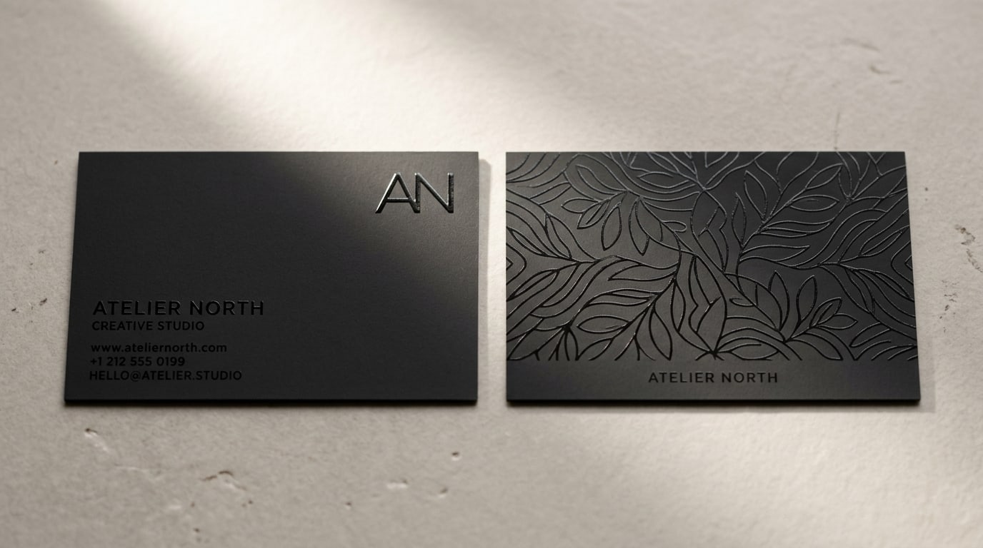
The card edge matters more than usual. Because the square format is already a noticeable design choice, the way you finish the edge becomes part of the conversation. Painted edge on a square card reads as fully premium. Standard cut edges read as understated-deliberate. Round corners on a square card read as soft and approachable — useful for restaurants, kids’ brands, hospitality. The Painted Edge Business Cards page lists the available edge colors if you want to see live options.
Premium finishes still work, with one caveat. Square + Akuafoil, square + raised foil, square + spot UV all look strong, but you have less canvas for the metallic element to breathe. Smaller foil marks, restrained spot UV, and tighter Akuafoil designs work better on square than full-coverage versions would. Our foil finishes comparison guide covers the trade-offs across the three metallic options.
File prep notes worth knowing
A few things that trip people up on a square spec sheet:
Final trim size is 2.5” x 2.5”. Set your artboard to 2.625” x 2.625” to include 0.0625” (1/16”) of bleed on every side. Keep critical type and the logo inside a 2.25” x 2.25” safe area. The full bleed, trim, and safe area checklist covers the standard margins and the most common file-prep mistakes.
There’s no “long edge” — call out top/bottom in your file naming. When you submit a two-sided design, label which side is intended to be the front. With rectangular cards the convention is obvious; with square cards it isn’t, and an unlabeled file gets oriented however the press operator decides.
Vertical and horizontal orientations are both valid. The card is square — there’s no wrong orientation. Pick one for the layout you want recipients to read first, then commit to it. Some brands design both front and back to work in any orientation, which is a clean move if the layout supports it.
Quantities work the same as standard cards. Most square card jobs are 250, 500, 1,000, or 2,500. The per-card cost drops at the same break points as rectangular cards.
Quick recommendation matrix
A working starting point for whether square fits:
- Restaurant, bar, hospitality concept → square cards, soft-touch matte, restaurant brand colors
- Boutique retail, candle/florist/ceramics studio → square cards, uncoated or Silk finish
- Architecture practice or design studio → square cards, minimal layout, optional painted edge
- Interior designer (residential) → square cards, soft-touch with a single spot UV monogram
- Modern real estate broker → square cards, premium stock, brand-aligned color
- Wedding planner or event designer → square cards, Pearl stock or painted edge
- B2B salesperson, attorney, traditional advisor → Standard Business Cards in rectangular
- High-volume trade-show handouts → standard rectangular, save the format change for a different card
- Card needs to live in a wallet → rectangular, every time
If you’re on the fence, the safer move is to order a small test run — 250 cards — in the square format with your top design before committing to 1,000+ cards. Square reads very differently in person than it does in a PDF mockup, and seeing how the cards stack, sit, and get handled in real use is the fastest way to know whether the format helps your brand or works against it.
Where to go from here
Square cards live in the Business Cards catalog with live pricing on every paper stock and finish. If you’re also looking at non-standard shapes more broadly — rounded corners, ovals, slim rectangles — the Rounded 4 Corners Business Cards and Rectangle Business Cards product pages cover the rest of the shape options. More finish and format guides live on the BQP blog.
More on Business cards
Pearl business cards: subtle shimmer that fits weddings and luxury events
A working guide to pearl business cards — what the pearlescent finish actually does, when shimmer reads elegant instead of cheap, and which brands it fits best.
Slim business cards: when the half-height 1.75" x 3.5" format actually works
A working guide to slim half-height business cards — when the long narrow format helps your brand, when it gets in the way, and how to design for it.
Spot UV business cards: subtle accent vs full-coverage pattern
A working guide to spot UV business cards — when a single glossy element does more for your brand than full coverage, and when the pattern approach actually pays off.