Linen uncoated business cards: the underrated finish that quietly outclasses gloss
Linen uncoated business cards are the most overlooked option in the catalog — textured, matte, writeable, and quietly upscale. Here's when they're the right call.
Walk through any business card ordering flow and you’ll see the same three finishes sold hard at the top: gloss, matte, soft-touch. Linen uncoated almost always sits further down the menu, quietly waiting, often passed over. That’s a shame — for a specific kind of brand, linen uncoated pulls ahead of the popular three without costing more or asking for a redesign.
Here’s a working guide to when it’s the right call, when it isn’t, and what changes in the file when you commit to it.
What linen uncoated actually is
Two things are happening on a linen uncoated card, and it helps to separate them.
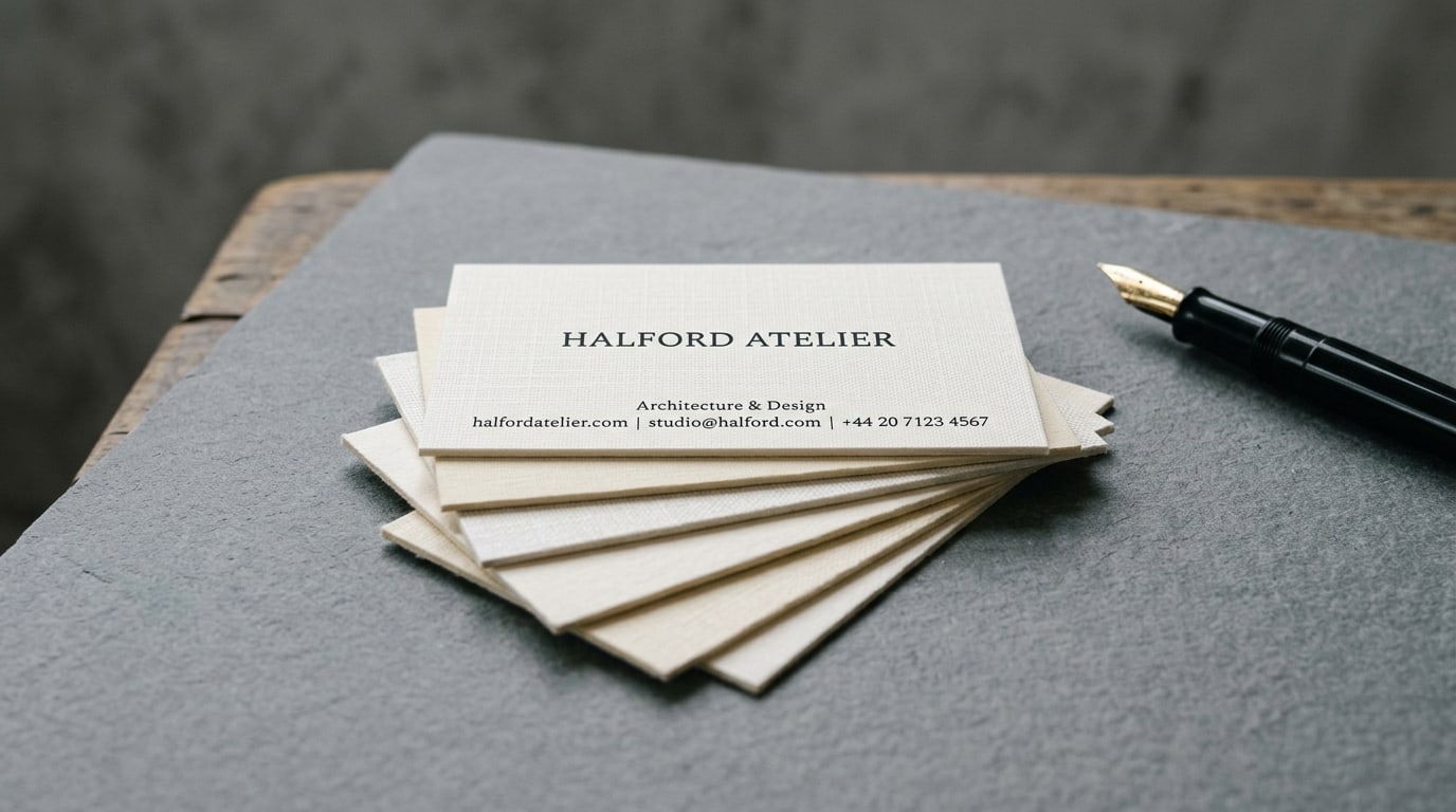
The first is the stock itself: a fine cross-hatched embossed pattern pressed into the surface of the paper during manufacturing, so the card has a subtle woven texture you can feel with a fingernail. It’s modeled on the appearance of fine linen fabric — hence the name — and it shows up as a quiet grid of micro-shadows under ordinary light.
The second is that the stock is uncoated: no gloss layer, no matte aqueous, no soft-touch laminate sealing the surface. The ink soaks slightly into the paper rather than sitting on top of it. The result is a card that looks soft, reads warm, and absorbs light instead of reflecting it.
Those two qualities — textured and uncoated — combine to produce a card that feels distinctly different from anything in the standard coating lineup. It’s the closest a commercial print finish gets to the hand-pressed, letterpress, artisan look without the actual cost and lead time of letterpress.
Where linen uncoated wins
The finish quietly outperforms gloss and matte for a specific set of brands:
Architecture and design studios. The texture reads as craftsmanship without shouting about it. A clean serif logotype on a cream linen uncoated card looks at home in any portfolio; the same logo on gloss looks like a marketing flyer.
Law firms, accounting practices, and financial advisors who want to read traditional rather than corporate. A textured uncoated card sits between Big-4 accounting matte and boutique private-wealth-manager. For solo practitioners and small partnerships, that’s exactly the perceived weight you want.
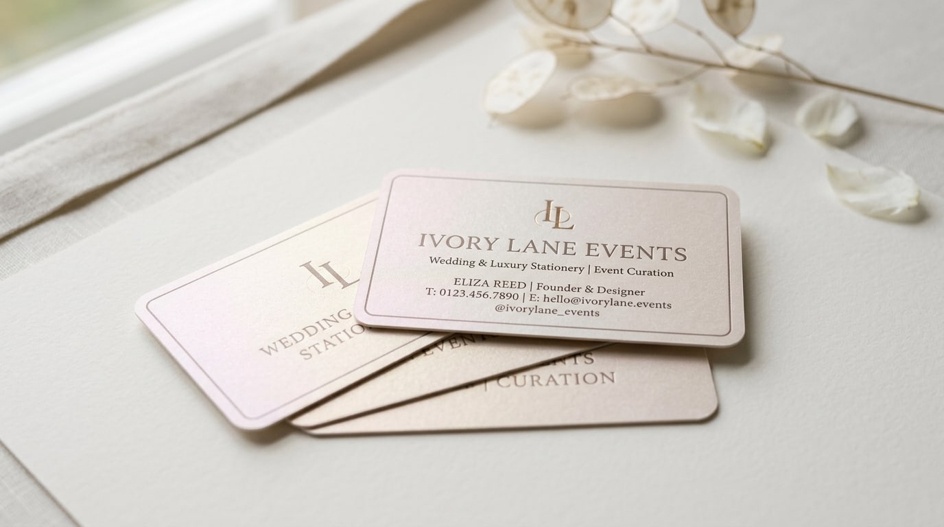
Wedding planners, calligraphers, stationers, and luxury-event brands. Linen uncoated is the closest the standard catalog gets to the texture and matte feel of letterpress wedding invitations.
Anyone who actually writes on cards. Because the stock is uncoated, ballpoint, gel pen, fountain pen, and pencil all bite into it cleanly. Most coated cards either smudge or refuse the pen entirely. Real estate agents writing showing times, stylists writing next-appointment dates, and consultants noting follow-ups all benefit measurably.
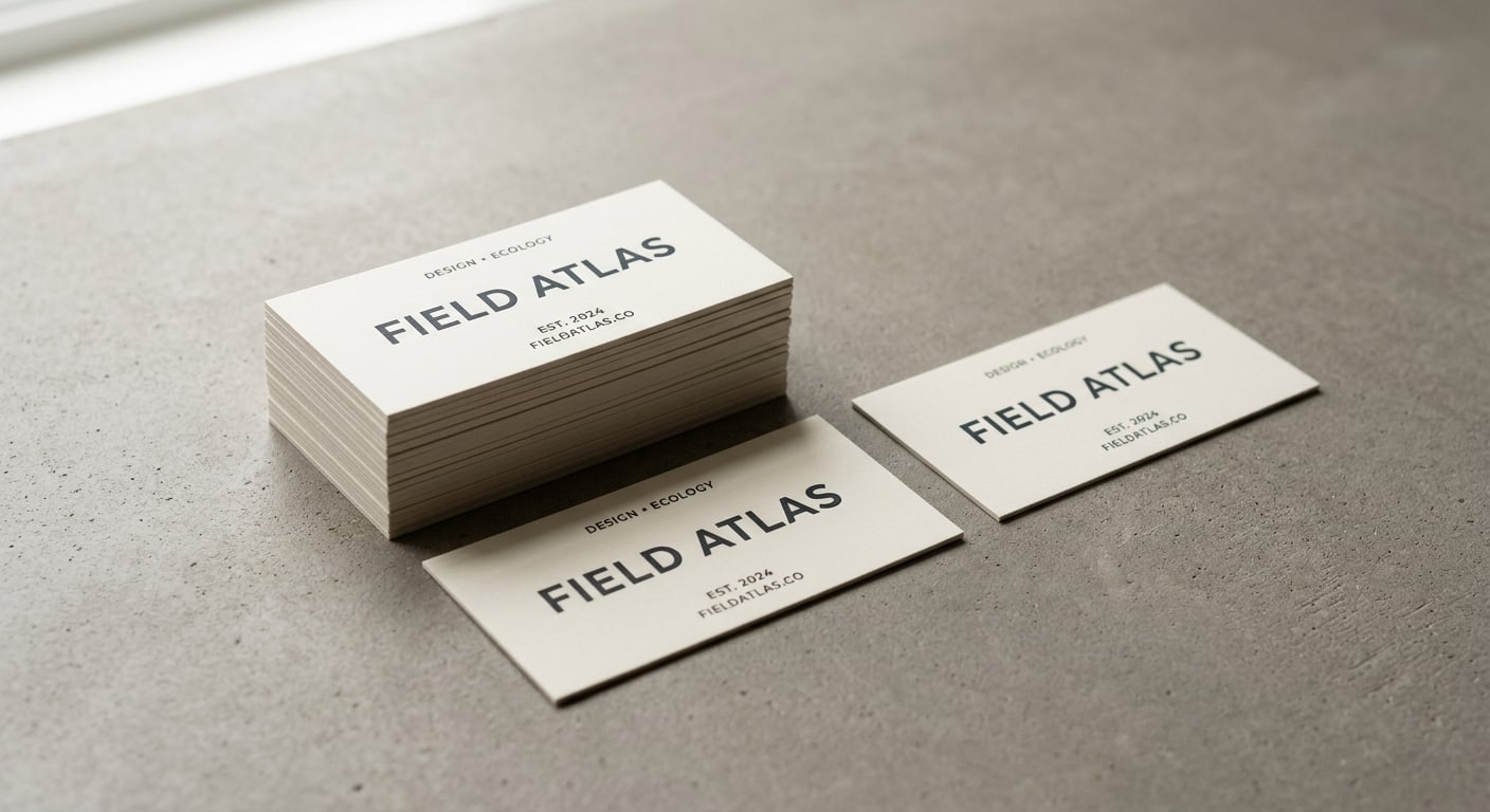
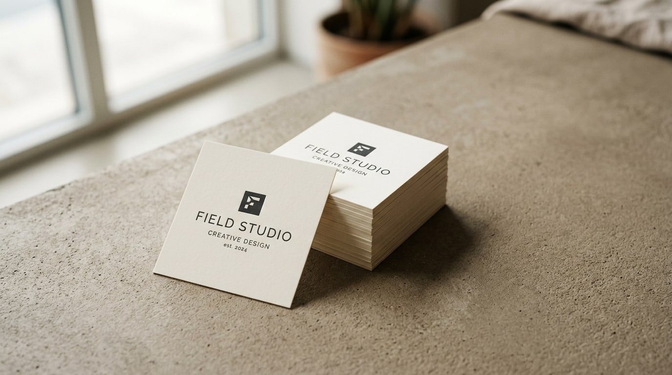
Conservative brand palettes. The texture does enough visual work that a card with two ink colors and tasteful typography looks finished — no foil block or die-cut needed.
You can order Linen Uncoated Business Cards directly when those constraints fit.
Where linen uncoated loses
It’s not a universal answer. Skip linen uncoated when:
- Your design depends on color saturation. Uncoated stock absorbs ink, which means colors print roughly 10-20% less saturated than they do on gloss or matte coated. A vivid coral or hot teal on linen uncoated will read closer to muted brick or dusty teal. If your brand is built on punchy color, Standard Business Cards in gloss or matte coated will represent it better.
- You need a full-bleed photograph on the card. Photos on uncoated stock look painterly rather than crisp — fine for an artist’s card, wrong for a real-estate-agent headshot card. The texture also interrupts continuous-tone images in a way that flatters illustrations and hurts photography.
- The card is going to a high-volume distribution environment. Linen uncoated is more vulnerable to soiling than coated finishes. A card living in a salesperson’s pocket for weeks, in and out of contact with keys and receipts, will show wear faster than a gloss card would. For trade-show volume distribution, coated stock survives better.
- You’re trying to look modern-minimalist-tech. SaaS, fintech, and tech-consulting brands typically want a flatter, more “screen-correct” surface. Soft-touch or matte coated does that better than linen uncoated, which leans warm and analog.
What changes in the file when you commit to linen
A few practical adjustments make linen uncoated print at its best.
Boost contrast in your dark elements. The uncoated surface absorbs ink, so fine type and dark areas dry back slightly muddier than on coated. Pure 100K is often crisper than rich black for small type, and sub-9pt thin-weight type tends to lose hairlines into the texture.
Avoid huge solid color fills, especially in dark hues. A 100% coverage dark navy or burgundy will show texture variation under raking light — that’s the look, not a defect, but it surprises clients who weren’t warned.
Run colors slightly hotter than your screen suggests. Uncoated stock dries back about 5-15% in saturation. Designers who proof on screen often end up underwhelmed by the first batch; pushing brand colors ~10% brighter in the file fixes it.
Standard bleed and safe area still apply — 0.125” bleed, 0.125” inside the trim line, CMYK PDF. If you’re new to print file prep, our print file checklist covers the basics.
Linen uncoated vs the popular three
A working comparison:
| If you want… | Linen uncoated | Gloss | Matte coated | Soft-touch |
|---|---|---|---|---|
| Maximum tactile differentiation | Strong — textured surface | Weak | Weak | Strong (smooth velvet) |
| Highest color saturation | Lowest | Highest | Medium | Medium |
| Writeable surface | Best | Worst | Good | OK with gel/sharpie |
| Photo-friendly | Weak for photos | Strong | Strong | Strong |
| Premium feel without extra cost | Strong | Weak | Medium | Strong (but costs more) |
| Holds up in wallet over months | Weak (shows wear) | Strong | Strong | Medium |
| Looks intentional with minimal design | Strong | Weak | Medium | Strong |
If you can’t pick between linen uncoated and soft-touch, the question to ask is: do I want the texture to read visually, or only on contact? Linen reads visually from across a desk — the texture is part of how the card looks. Soft-touch only reveals itself when someone picks it up. For a card that’s going to be seen as much as touched, linen pulls ahead.
Pairing with letterhead and envelopes for a coordinated set
One quiet win of choosing linen uncoated: the texture is available across the rest of the stationery system too. For a brand that wants a coordinated paper feel across every touchpoint, all three pieces match without a finishing handoff:
- Linen Uncoated Letterheads for proposals and printed correspondence
- Linen Uncoated Envelopes — the texture is even more noticeable on the envelope flap than on the card
- Linen Uncoated Postcards for save-the-dates, gallery announcements, or appointment reminders
That matched-set capability is where this finish punches above its weight. A soft-touch card with a glossy envelope doesn’t read like a coordinated brand system. Linen does.
Quick recommendation matrix
A working frame for picking it:
- Architect, designer, stationer, calligrapher → linen uncoated, dark ink on cream
- Solo law/accounting/financial practice that wants to read traditional → linen uncoated, two-color minimal type
- Wedding planner, event stylist → linen uncoated, often paired with painted edge — see Painted Edge Business Cards if you want the upgraded version
- Photographer with a portfolio-forward brand → linen uncoated for the wordmark side, but think hard if you want a photo on the back (it will look painterly)
- High-volume B2B sales → skip linen, use Standard Business Cards in gloss
- Brand built on color → skip linen, use Silk Business Cards or matte coated standard
- Brand built on tactile premium → linen uncoated or Suede Business Cards, depending on whether you want texture you can see or texture you only feel
Where to go from here
If linen uncoated fits the brief, place a small starter order — 250 or 500 cards — and live with them for two weeks before scaling up. The texture is one of those finishes that’s hard to evaluate from a swatch and easy to evaluate from a stack in your hand. You’ll know within a day whether the texture is doing the work for the brand.
Browse the full business cards collection if you want to compare against the other paper options, or head to the blog for guides on the rest of the standard finishes — gloss, matte, soft-touch, painted edge, and the specialty options live in their own posts.
The short version: linen uncoated is what you reach for when the brand is supposed to whisper rather than shout, when the cards will be written on, and when “expensive paper” should be obvious before anyone reads the type. Most catalogs hide it three clicks deep. It deserves a higher seat.
More on Business cards
Pearl business cards: subtle shimmer that fits weddings and luxury events
A working guide to pearl business cards — what the pearlescent finish actually does, when shimmer reads elegant instead of cheap, and which brands it fits best.
Slim business cards: when the half-height 1.75" x 3.5" format actually works
A working guide to slim half-height business cards — when the long narrow format helps your brand, when it gets in the way, and how to design for it.
Square business cards: when the 2.5" format fits your brand (and when it doesn't)
A working guide to square 2.5" x 2.5" business cards — when the non-standard format helps you stand out, when it gets in the way, and how to design for it.