Painted edge business cards: when 32pt thickness is worth the upcharge
A working guide to painted edge business cards — why they exist, how 32pt stock changes the math, what edge colors look right, and when the premium pays off.
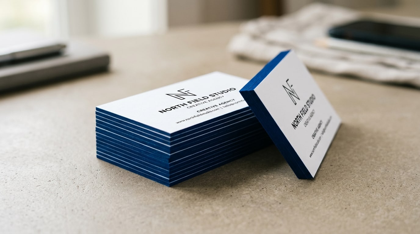
A painted edge business card is the easiest way to make someone notice your card without saying anything weird about it. The face of the card looks normal — clean printed artwork on premium uncoated stock — but the side profile shows a saturated band of color that catches the light when the card is held, handed over, or set down on a table.
It’s a finish that depends entirely on thickness. Painted edge on a normal 14pt or 16pt card barely registers; you can’t see the color band from across a desk. The magic shows up at 32pt — two pieces of 16pt stock laminated together with the painted color sealed in the middle layer — and that thickness is also the reason the cards cost more than the standard option. Here’s how to decide whether the upgrade earns its keep for what you’re handing out.
What “painted edge” actually is
The process is mechanical, not just decorative. After the card faces are printed and trimmed, the stack of cards is run through a paint station that applies pigmented ink to the cut edges. On a single-layer 16pt card, that paint sits on a thin band of paper roughly 0.4mm tall. On a 32pt duplex card, the painted band is twice as tall and visually reads as a deliberate design feature instead of a color hairline.
A few things happen because of that:
- The thickness reads in the hand, not just the eye. 32pt cards are noticeably stiffer than 14-16pt — they feel substantial when someone takes one from you, which is half the point.
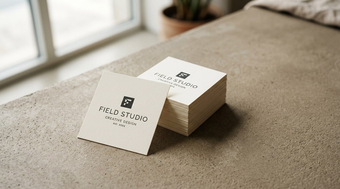
- The painted edge becomes the brand element, not just an accent. Held face-down, the card still says “premium” without showing the logo.
- The duplex construction enables color contrasts the single-layer process can’t pull off — like a black face with a hot pink edge, or a cream face with a deep navy edge.
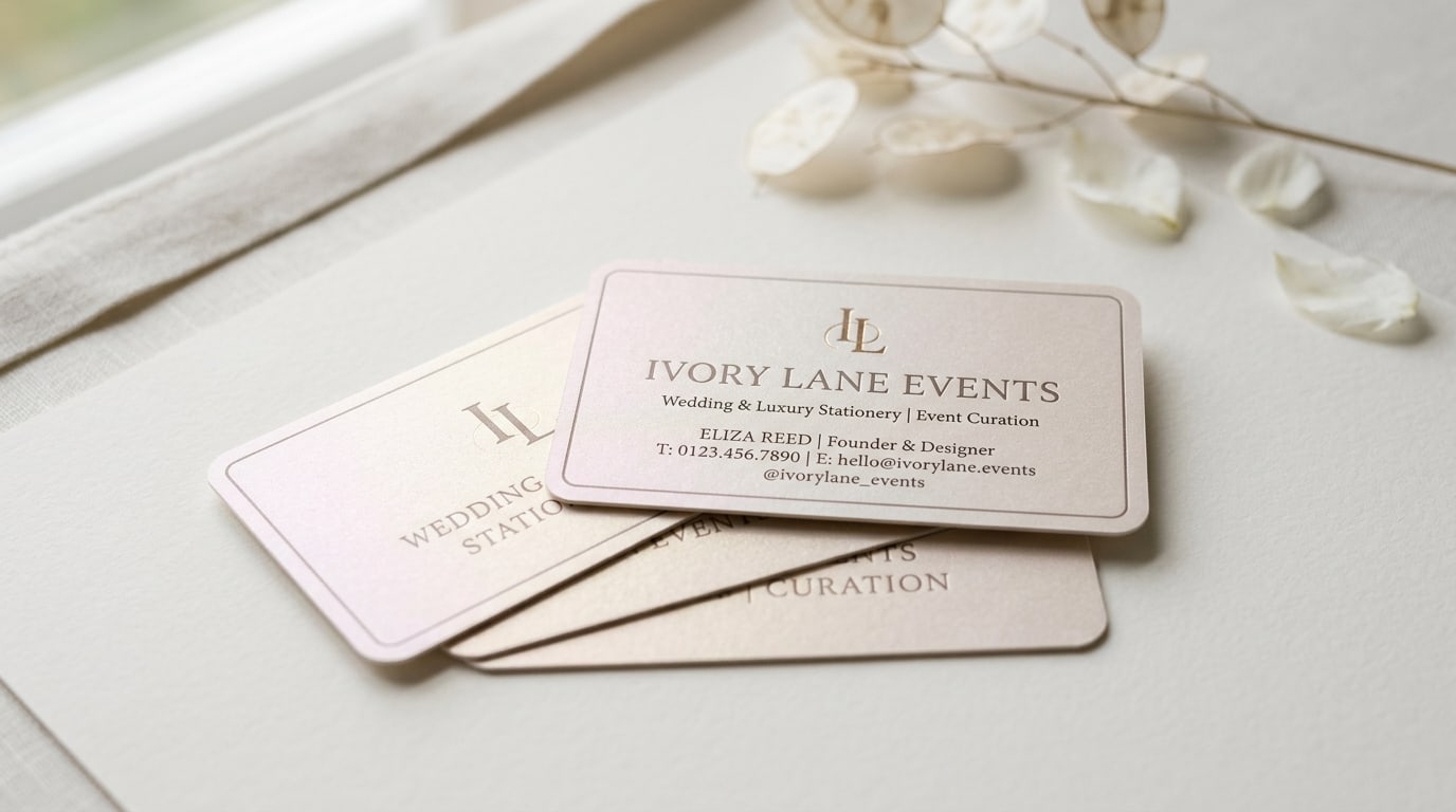
If you’ve held a card from a wedding planner, a high-end design studio, an architecture firm, or a luxury real-estate agent, there’s a good chance it was painted edge on 32pt.
When the upgrade is worth it
Painted edge business cards on 32pt stock aren’t the right answer for every business. They are the right answer when:
- Your card is a sales tool that has to feel expensive. Wedding photographers, interior designers, jewelers, custom framers, hair stylists handling above-average ticket prices — anywhere the perceived quality of the card sets up the perceived quality of the work.
- You hand out fewer cards but they each matter more. A consultant giving cards at a conference is different from a tradesperson dropping cards into mailboxes. If your card is going to a decision-maker who is meeting one or two people that day, weight is leverage.
- The brand identity already trades on tactile or analog cues. Brands with hand-drawn logos, serif typography, neutral palettes, and “studio” in the name benefit visibly from painted edge. Tech companies and SaaS brands often don’t.
- You want a quiet luxury cue. Painted edge whispers; foil and embossing shout. There’s room for both, but the painted edge approach reads as confident rather than performative.
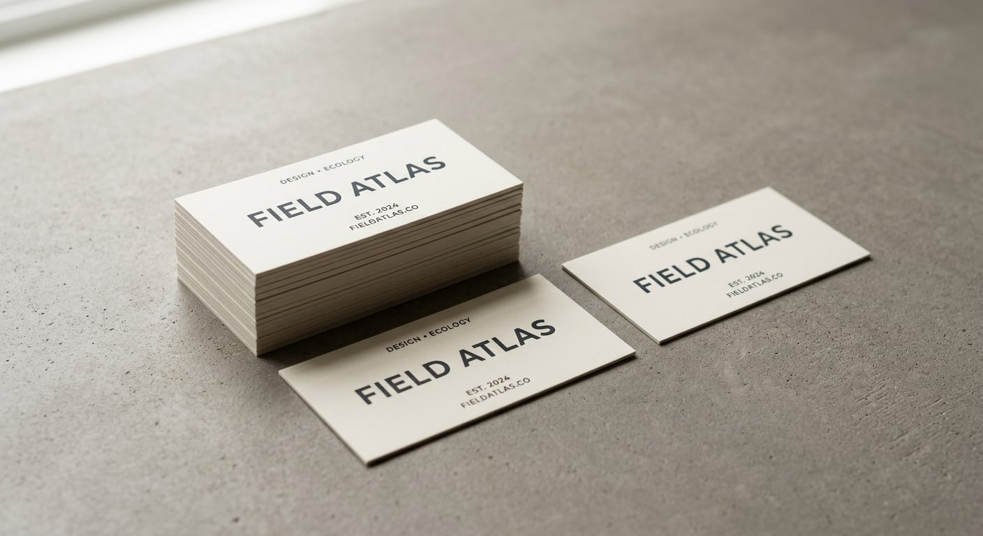
It’s also a finish that genuinely helps when your face design is restrained. The more minimal the front of the card — small mark, small type, clean white space — the more the painted edge does the visual work for you.
When it isn’t worth it
Skip painted edge if:
- You give out cards in large volume. If you’re handing out 500 cards a month at trade shows, the upcharge is real and the marginal recipient probably isn’t paying close enough attention to notice the edge anyway. Stick with Standard Business Cards on 16pt with a soft-touch or matte finish.
- Your work is technical or volume-driven. Plumbers, electricians, IT consultants, B2B salespeople in commodity categories — the audience values legibility and the phone number on the back, not card construction.
- Your design needs full-bleed photography. Painted edge tends to look awkward against full-bleed images on the face — the colored band fights the photograph. It works better against solid color blocks or generous white space.
- Cost matters more than perception. This is a $100-200 upgrade per 500 cards relative to standard. If that math isn’t justified by what one new client is worth, run the cheaper option.
Picking an edge color that doesn’t fight your brand
Edge color choice is where most painted edge cards go wrong. The default reflex is “use my brand color” — but on a thin band of paper, brand colors that look fine in a logo can look muddy or cartoonish.
A working rule of thumb:
- Saturated colors carry better than pastels. A deep teal edge on a cream card looks intentional. A soft mint edge on the same card just looks faded.
- Monochrome works. Black edge on white face. White edge on black face. They’re hard to make look bad.
- High-contrast edges read at the longest distance. Hot pink on black. Bright orange on charcoal. These show across a room when the card is sitting on a table.
- Avoid metallic-looking edges. If you want metallic, use Akuafoil Business Cards or Raised Foil Business Cards — actual foil — instead. Painted edge metallics never look as sharp as the real thing.
If you’re not sure, order a small test run in your top color choice before committing to a full 1,000-card run. Color shifts between the design file and the painted edge are normal, and seeing it in person is faster than guessing.
How painted edge compares to other premium finishes
A working comparison if you’re trying to pick between premium card options:
- Painted Edge — Thick, edge-colored, restrained. The face looks normal; the side does the work. Best for low-volume premium use.
- Akuafoil — Selective metallic shimmer combined with full-color print on the face. Best when the design itself needs to pop on the front.
- Raised Foil — Solid metallic foil that physically sits on top of the surface. Tactile. Best for logo-forward designs where the foil IS the brand element.
- Pearl — Pearlescent shimmer baked into the stock itself. Soft, wedding-and-luxury territory.
- Silk and Suede finishes — Soft, smooth textures that change how the card feels in the hand without changing thickness or showing color on the edge.
If you can’t decide between painted edge and one of the others, the question to ask is: does the front of my card already do enough? If yes, painted edge adds presence without changing the design. If no, a face finish (foil, Akuafoil, raised UV) is doing more work for you than an edge color will.
Quick recommendation matrix
- Wedding planner, interior designer, photographer → painted edge, navy or charcoal on cream
- Architecture or design studio → painted edge, black on white or white on black
- Luxury real estate → painted edge, deep saturated color on cream
- Restaurant or hospitality concept → painted edge in a brand-aligned saturated color
- High-volume B2B sales → standard 16pt, save the budget
- Technical / trade work → standard 16pt or Plastic Business Cards for durability
- Brand needs metallic → Akuafoil Business Cards or Raised Foil Business Cards, not painted edge
Production notes worth knowing
A few things that affect how the cards turn out:
Quantity matters for cost-effectiveness. Painted edge is most cost-effective at 500-2,500 cards per run. Below 250 the per-card setup cost is steep; above 5,000 you’re paying premium for cards you’ll throw away unused.
Bleed and trim are stricter. Because the edges are painted after trimming, any artwork that runs to the edge has to be a clean full bleed — no soft fades to white at the edge, because the painted color will stop where the print stops. If you need help getting your file ready, our print file checklist for bleed, trim, and safe area is worth a five-minute read.
Lead times are longer. Painted edge cards take an extra 1-3 business days versus standard production because of the post-trim paint step. Plan for it on rush jobs.
Round corners are an option. A 32pt card with painted edges and round corners reads even more deliberately premium than square corners. Both are available on the Painted Edge Business Cards product page.
When you’re ready to compare options across all premium finishes, the Business Cards and Majestic Products collections have live pricing on every variant. Or check the rest of the BQP blog for guides on Akuafoil, paper stocks, and file prep.
More on Business cards
Pearl business cards: subtle shimmer that fits weddings and luxury events
A working guide to pearl business cards — what the pearlescent finish actually does, when shimmer reads elegant instead of cheap, and which brands it fits best.
Slim business cards: when the half-height 1.75" x 3.5" format actually works
A working guide to slim half-height business cards — when the long narrow format helps your brand, when it gets in the way, and how to design for it.
Square business cards: when the 2.5" format fits your brand (and when it doesn't)
A working guide to square 2.5" x 2.5" business cards — when the non-standard format helps you stand out, when it gets in the way, and how to design for it.