Soft-touch vs gloss vs matte business cards: which finish should you order?
The three most-ordered business card finishes feel completely different in the hand. Here's how each one performs, and how to pick the right one for your brand.
If you order standard 16pt business cards from any commercial printer, you’ll be asked to pick a coating: gloss, matte, or soft-touch. They cost almost the same, the print quality is identical, and most online order forms barely explain the difference. But the three feel completely different in the hand, and the wrong pick can quietly undermine an otherwise great-looking card.
Here’s a working guide to each one — what it does well, what it doesn’t, and how to decide.
Gloss — bright, glossy, prints colors at their most saturated
A gloss coating is a clear UV-cured layer on top of the printed cardstock that produces a hard reflective shine. Light bounces off it, photographs catch a specular highlight, and printed colors look about 10-15% more saturated than they would on uncoated stock. It’s the default for most consumer-facing print: think real estate flyers, restaurant menus, postcards.
Where gloss wins:
- Color-heavy designs — full-bleed photos, gradients, vivid brand colors. The gloss makes them pop.
- Repeated handling environments — gloss resists fingerprints, smudges, and minor scuffs better than matte. Cards that live in a fishbowl drawing or a salesperson’s pocket survive longer.
- Budget-conscious orders — gloss is the most common finish, so quantities run smoothly through any press without setup adjustments.
Where gloss loses:
- It looks cheap on professional-services cards (legal, financial, medical, executive). The shine reads as “marketing” rather than “credibility.”
- You can’t write on a glossy card with most pens. If your brand expects clients to scribble notes on the back, skip it.
- Photographs of gloss cards always have hot reflections that obscure the design — it’s a minor frustration if you photograph your work for a portfolio.
Standard business cards come in 16pt gloss as the default option.
Matte — flat, soft, no shine
A matte (or “matte aqueous”) coating is a clear protective layer that’s been chemically formulated to scatter light instead of reflecting it. The result: the printed colors look slightly muted, the surface has no shine at all, and the card has an understated quality that gloss can’t replicate.
Where matte wins:
- Professional services — legal, financial, executive, medical, architectural. Matte signals that the brand isn’t trying to grab you with shine; the design has to do the work.
- Photography-friendly — matte cards photograph cleanly with no glare, which is why most photographers and designers default to matte for their own cards.
- Writeable — most ballpoint and gel pens write cleanly on a matte coating, which matters for industries where clients write notes or appointment times on cards.
Where matte loses:
- Matte cards show fingerprints more visibly than gloss does, especially in dark colors. A pure black matte card with full coverage will pick up oily fingerprints fast.
- Colors look slightly less saturated. If your brand is built around vivid color, gloss or soft-touch will represent it better.
- Matte cards scuff a little faster than gloss in a wallet — minor surface scratches show up on dark matte more than on gloss.
If you want a step up in feel without committing to soft-touch, painted edge business cards on 32pt matte stock are an excellent middle path — the matte surface paired with a heavy stock and a colored painted edge feels distinctly premium.
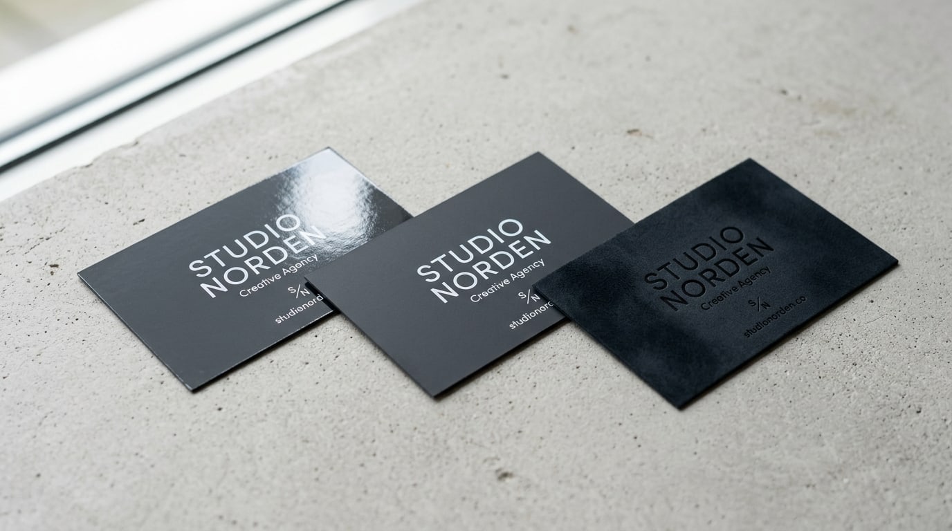
Soft-touch — velvety, almost suede-like
Soft-touch is a coated film laminate, not a liquid coating like gloss or matte. It’s a thin polymer layer applied to the card with heat and pressure, producing a surface that feels like silk or a peach skin in the hand. It’s the most distinctive finish of the three — most people who pick up a soft-touch card for the first time react audibly.
Where soft-touch wins:
- First-impression brands — luxury services, high-end hospitality, design studios, premium product brands. Soft-touch cards announce that the brand cared about the artifact itself.
- Dark designs that need depth — black soft-touch cards have a depth and richness that gloss and matte simply can’t reach. The light absorption makes the black read deeper, almost velvety.
- Tactile differentiation — at a trade show or a networking event where everyone is exchanging cards, the soft-touch is the one that gets remembered. People physically rub it between their fingers.
Where soft-touch loses:
- It’s the most expensive of the three finishes, typically 15-30% more than gloss/matte at the same quantity.
- Soft-touch shows fingerprints and oil more than matte does — the velvety surface holds them. On a near-black card, this is a real consideration.
- It’s not ideal for high-volume distribution where cards will be handled many times. The surface gets shiny in spots from concentrated wear (wallet pressure points, pocket friction).
- You can write on soft-touch with a sharpie or gel pen, but ballpoints don’t grip the surface well.
For the full luxury treatment, look at our Majestic Products collection — soft-touch is also available in combinations with painted edge, raised foil, and Akuafoil for cards that pull out every stop.
Quick decision matrix
A working frame:
| If your brand is… | Order |
|---|---|
| Real estate, retail, restaurant, service business | Gloss |
| Professional services (legal, financial, medical, executive) | Matte |
| Designer, photographer, architect, creative | Matte or Soft-touch |
| Luxury, hospitality, premium product, branding-forward | Soft-touch |
| You hand out 1,000+ cards a year and they need to survive abuse | Gloss (most durable) |
| You expect clients to write on the cards | Matte |
| You want maximum “where did you get these?” reaction | Soft-touch |
If you can’t decide, matte is the safest answer for most brands. It looks intentional, photographs cleanly, and never feels cheap. Gloss is the right move when color saturation matters most. Soft-touch is the right move when the artifact itself is part of the marketing.
A note on print quality
The coating doesn’t change the print quality of what’s underneath — the same 4-color CMYK halftone process runs whether you pick gloss, matte, or soft-touch. So if you’re worried about the card looking “less crisp” in matte: it won’t. The press passes are identical; only the finish layer differs.
What does affect crispness is paper stock thickness and a clean print file. If you haven’t built your file with proper bleed and safe area margins, the trim cut can clip text or create uneven white margins regardless of finish. Worth a quick read of our print file checklist before sending art to press.
Where to go from here
Browse the business cards collection to see all of the standard finishes, paper weights, and shape options. If your design is built around metallic accents or you want a card that combines specialty effects (foil, raised UV, soft-touch laminate), the Majestic Products collection is where the high-end finishes live.
When in doubt: order a small quantity in two finishes and compare them in the hand. Most printers (us included) can do a 250-card test run in matte and another in soft-touch for under $100 combined. Holding both versions for a day will tell you which one fits the brand faster than any guide could.
More on Business cards
Pearl business cards: subtle shimmer that fits weddings and luxury events
A working guide to pearl business cards — what the pearlescent finish actually does, when shimmer reads elegant instead of cheap, and which brands it fits best.
Slim business cards: when the half-height 1.75" x 3.5" format actually works
A working guide to slim half-height business cards — when the long narrow format helps your brand, when it gets in the way, and how to design for it.
Square business cards: when the 2.5" format fits your brand (and when it doesn't)
A working guide to square 2.5" x 2.5" business cards — when the non-standard format helps you stand out, when it gets in the way, and how to design for it.